ConsultSpace of SylphAI
Date: Spring 2023, Time: 3 Months,
Role: UI/UX Design, Usability Testing, Visual Design, Marketing Campaign Design.
Role: UI/UX Design, Usability Testing, Visual Design, Marketing Campaign Design.
Empathize
WHAT IS ConsultSpace USED FOR?
ConsultSpace allows you to have one-on-one sessions with experienced professionals. Whether you need guidance on your career development or assistance with challenges you are facing on your project, we have cost-effective consultants available for you. Our AI assistant can recommend the most appropriate consultants for you, and you can also become a consultant to help others and earn money. The product is launched on April 2023. ConsultSpace launch acquires 180% more users as of September 2023.
Creating a task is unique to SylphAI platform, and it has two advantages doing so: (1) it helps our AI matching algorithm recommend top candidates. (2) it allows the consultants to search and apply for tasks (given that the task is set to be public). Often consultants can do better at evaluating their fitting to the tasks than the client can.
BACKGROUND STORY
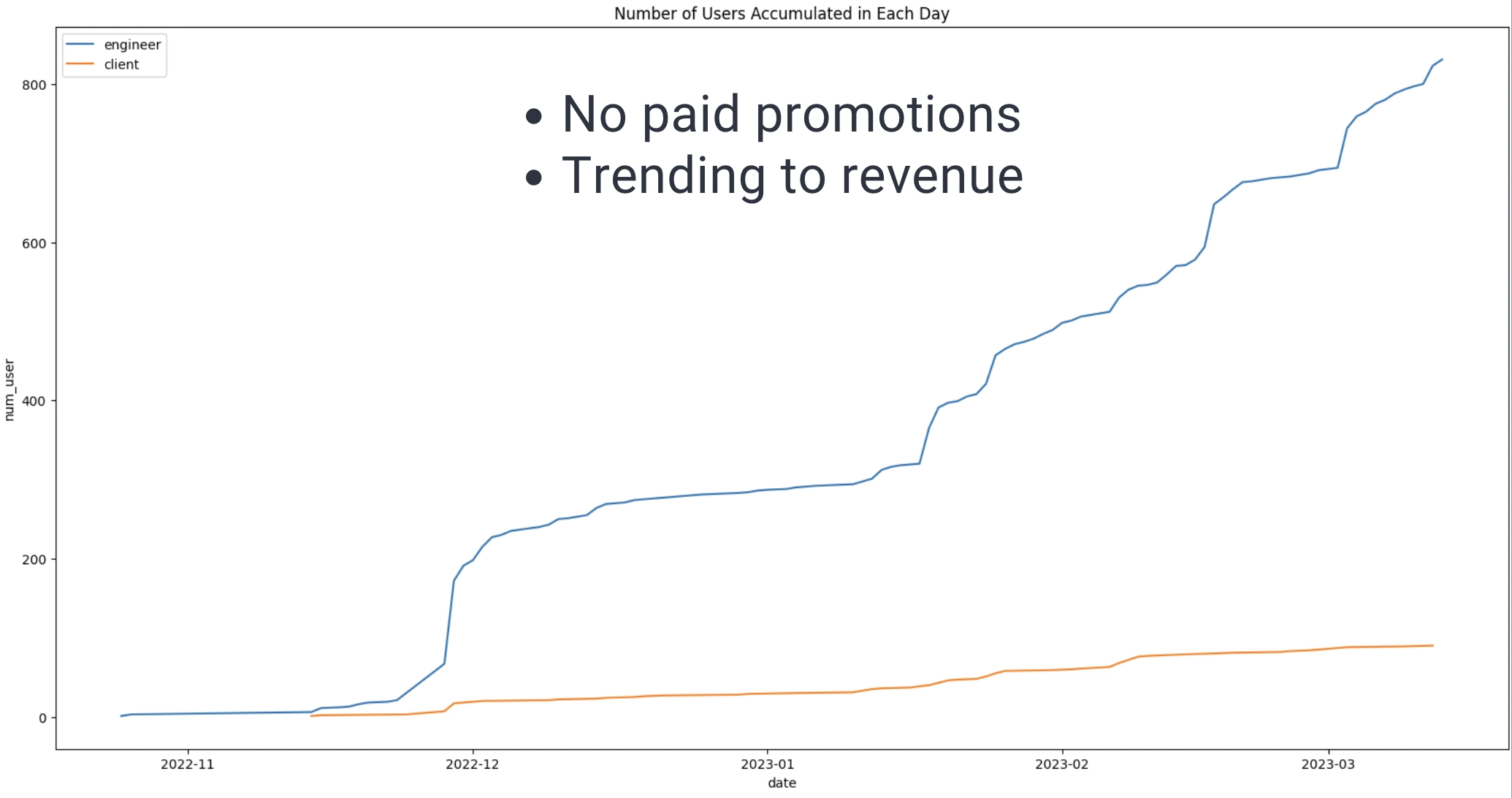
SylphAI is a B2C SaaS platform to connect AI Pros and AI talent seekers which means clients. SylphAI is a flexible workplace for AI Pros. SylphAI empowers a global community of almost a thousand AI professionals and talent seekers for project collaborations. What sets SylphAI apart from other SaaS products is that 70% of the value we offer comes from pairing clients' tasks and projects with the most suitable talent.
PROBLEM
Pain point: connecting with AI experts is so hard.
Startup owners and new workforce entrants lack guidance from experienced professionals, and experienced professionals want to earn more money.
Yet, no platform connects these groups, leaving reliance on platforms like LinkedIn, where messages often go unanswered.
The old problem with the new complications:
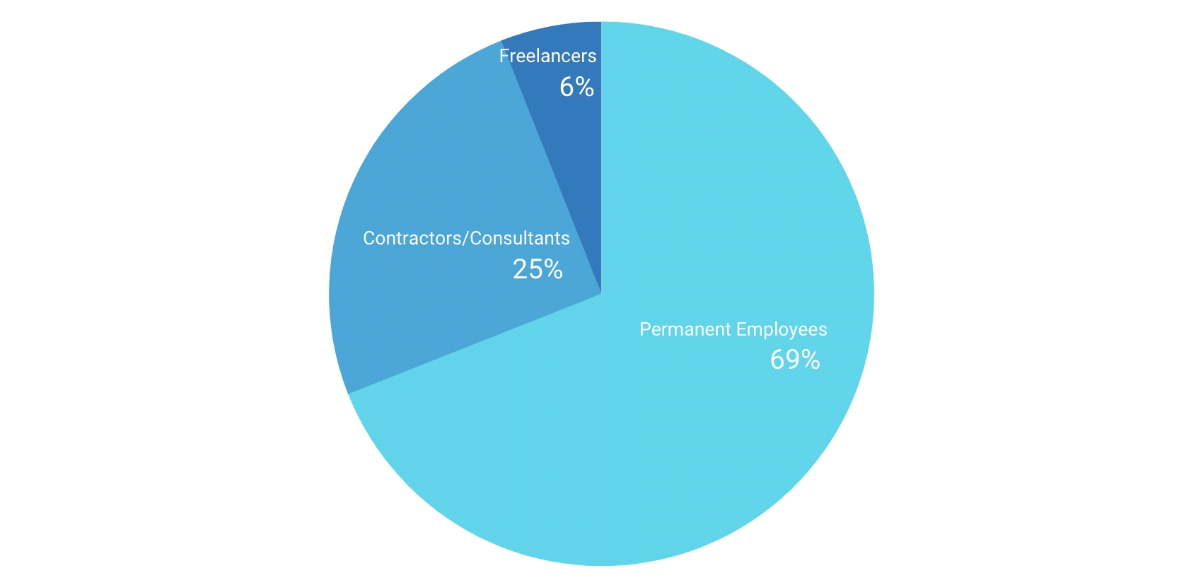
With SylphAI, you can directly fulfill your AI consulting and projects needs by matching your consulting tasks and projects with AI experts using AI. There is no middleman during this process.
Why we want to develop this new product ConsultSpace?
We only have ProjectSpace and TeamSpace on our platform back then, but according to the researches and feedbacks from our users, we found that users might have questions while working on the projects and want to get these questions answered by AI experts.
Moreover, as a startup, we want to have a good business model and grow profits simultaneously. We charge 10 percent as the service fee for clients using our ConsultSpace service.
ConsultSpace is where client can book 1:1s with AI experts for product ideas, scoping, feedback, and VC due diligence.
PROJECT GOAL
BUSINESS GOAL
PRODUCT ROADMAP
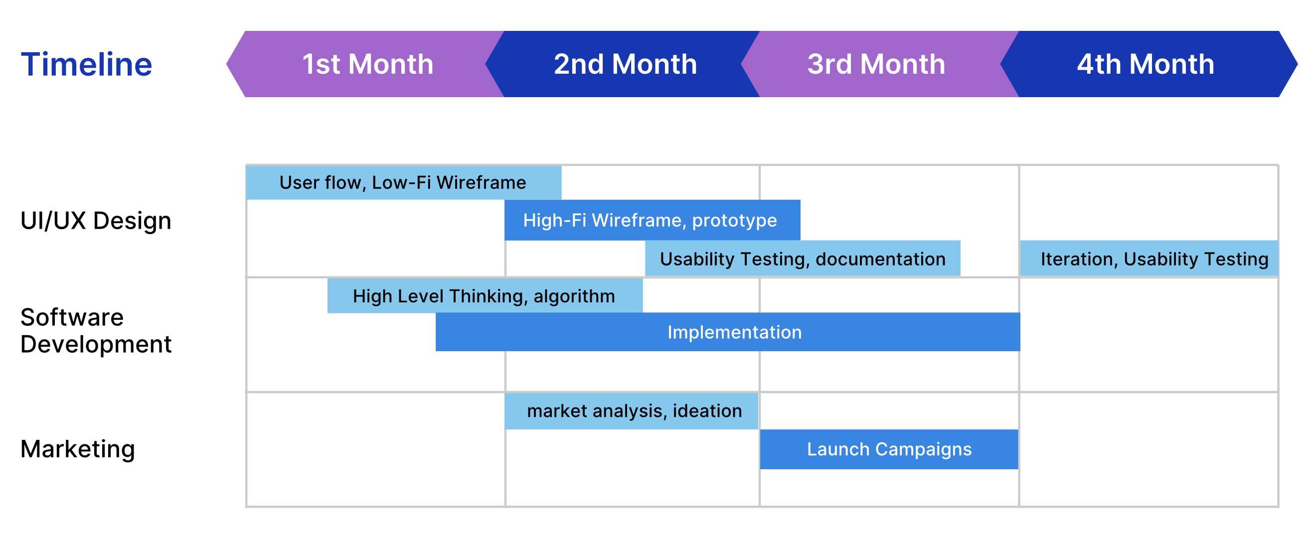
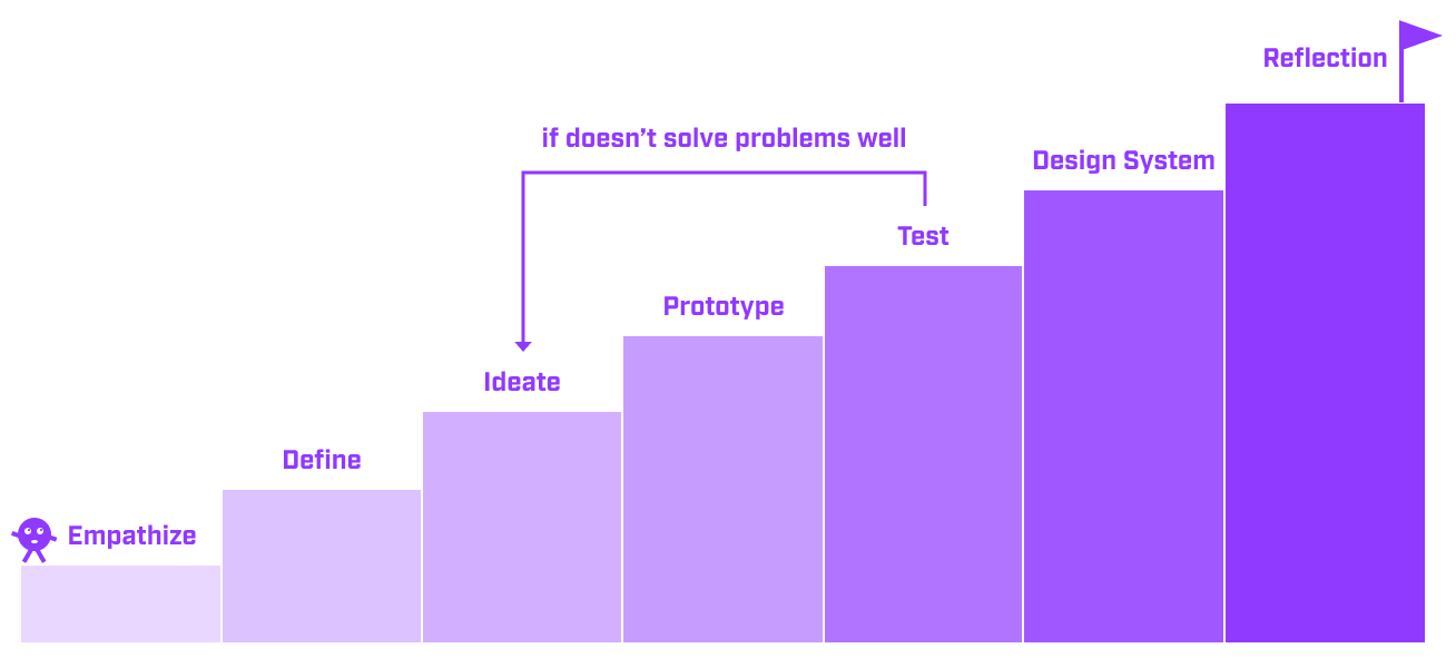
PROCESS OVERVIEW
Define
DESIGN CHALLENGE
How might users on our platform find their target experts easily?
DESIGN SOLUTION
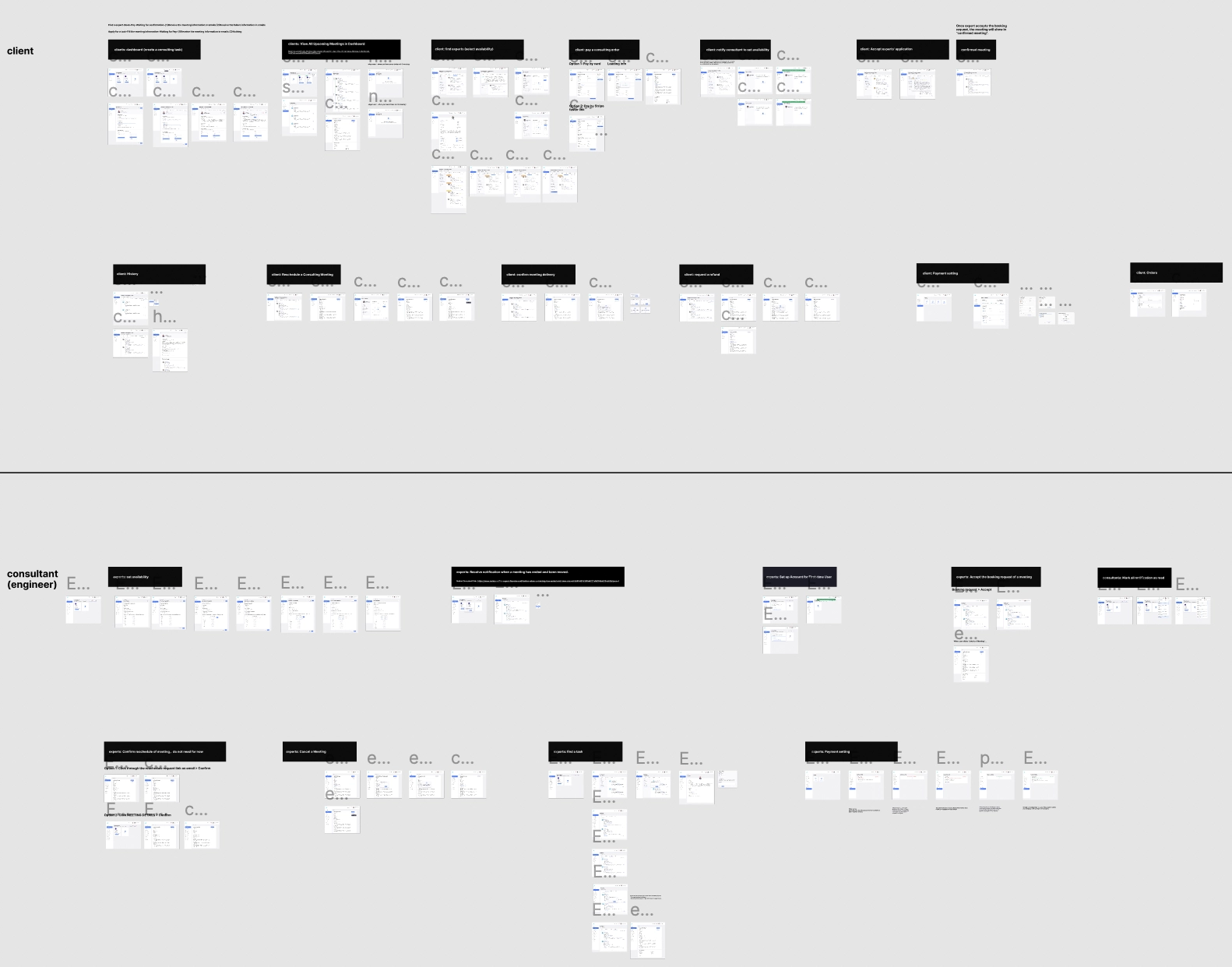
Consulting platform end-to-end solutions:

COMPETITIVE ANALYSIS
To create my design mood board for ConsultSpace, I took inspiration from firsthand experiences with Firsthand, ADPlist, and Calendly, which offer similar features including search functionality, task management, and booking.
Firsthand's Advantages:
Firsthand's Shortcomings:
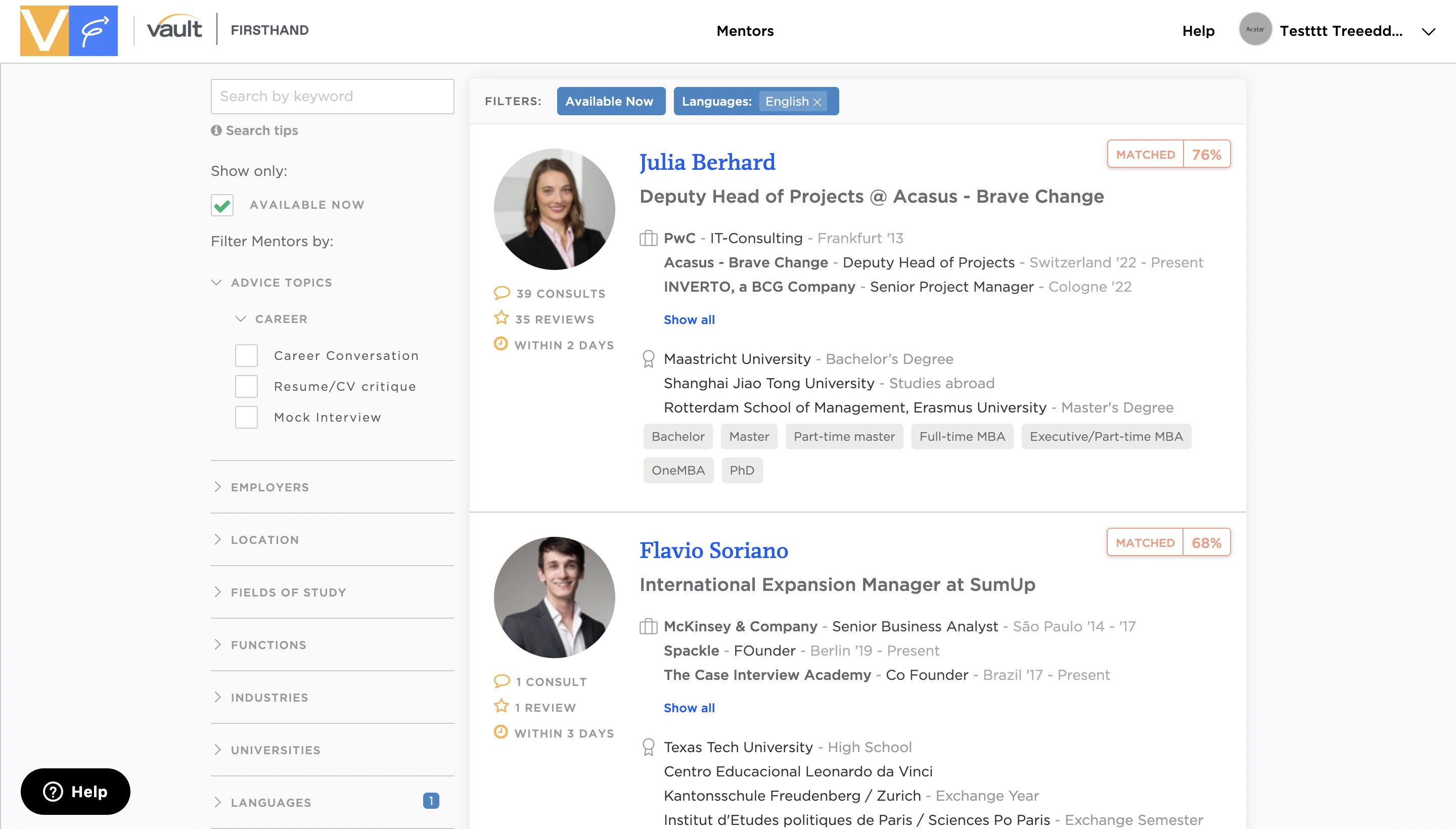
ADPList's Advantages:
ADPList's Shortcomings:
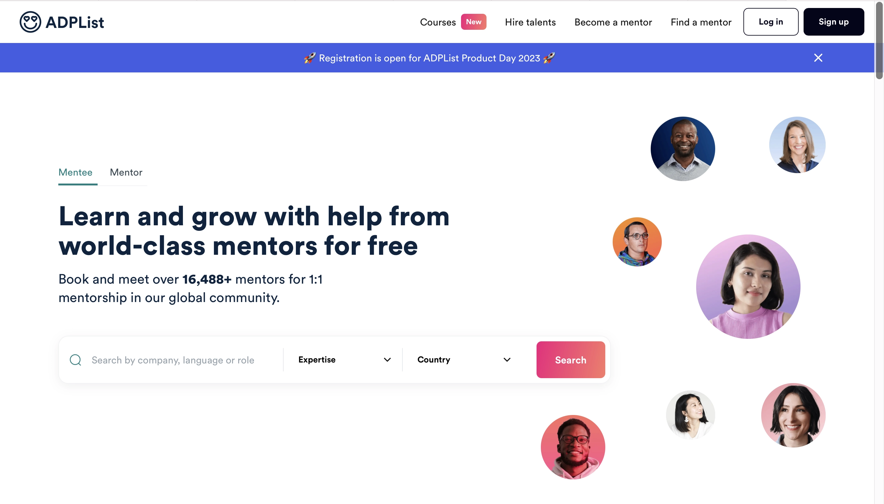
Calendly's Advantages:
Calendly's Shortcomings:
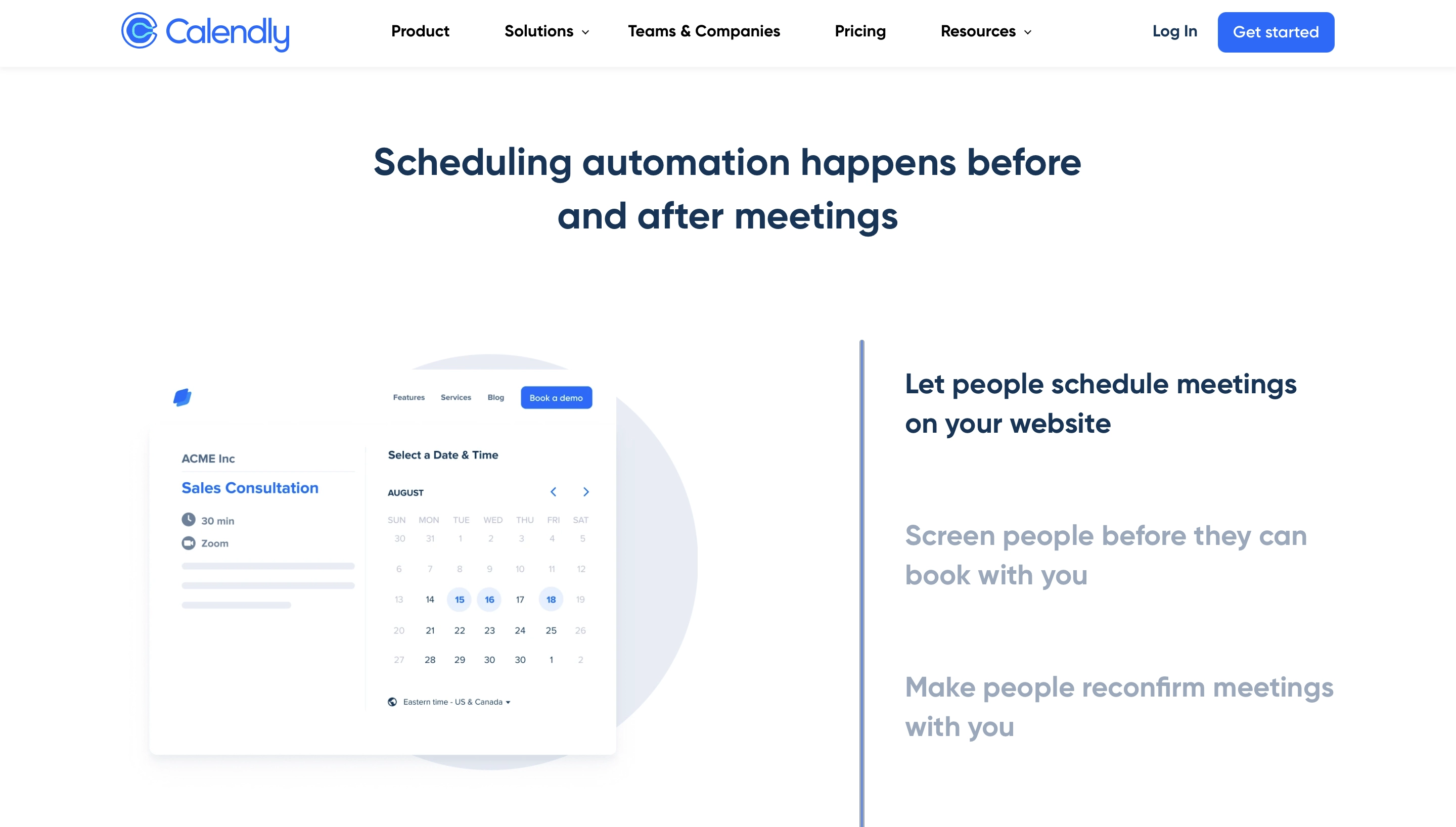
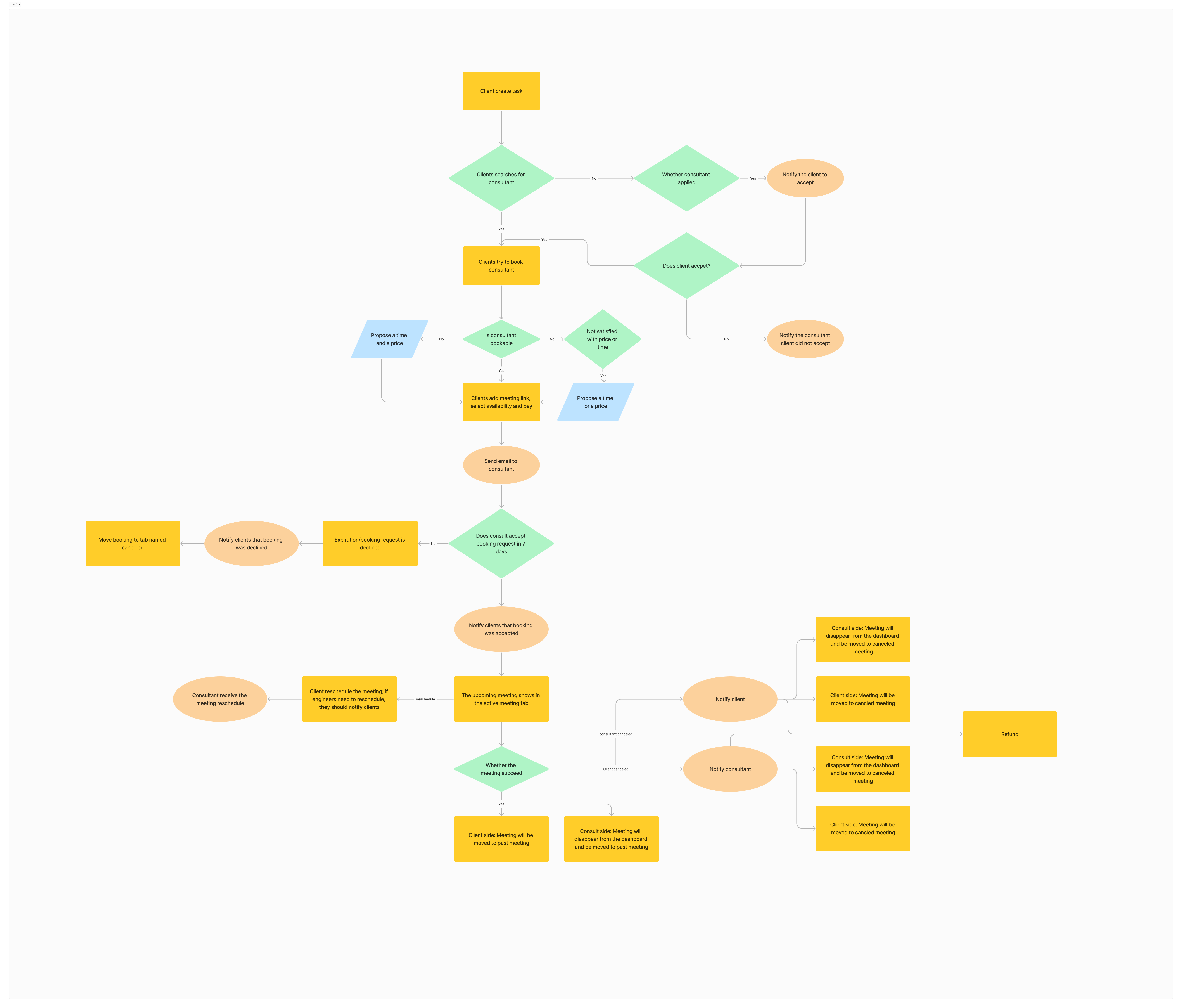
User Flow
1.Create a task,
2.Match candidates / Direct bookable consultants / Non-direct bookable consultants / Applications,
3.Book meetings,
4.Attend meetings.
1.Search for tasks,
2.Apply for a task,
3.Confirm meeting.
Ideate
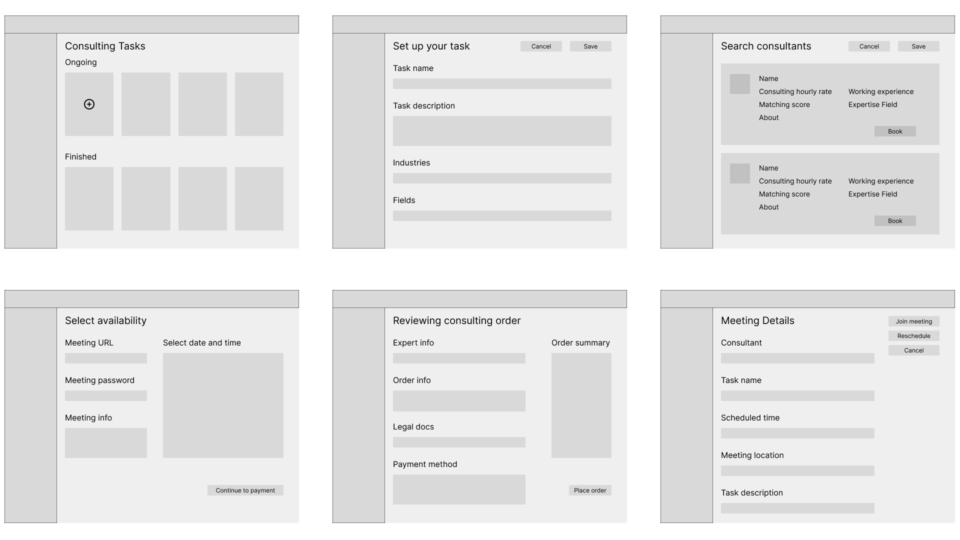
With the user flows in mind, I started working on designing and conducting user testing including contextual inquiry (in-person and remote) and A/B Testing.
WIREFRAME
DESIGN
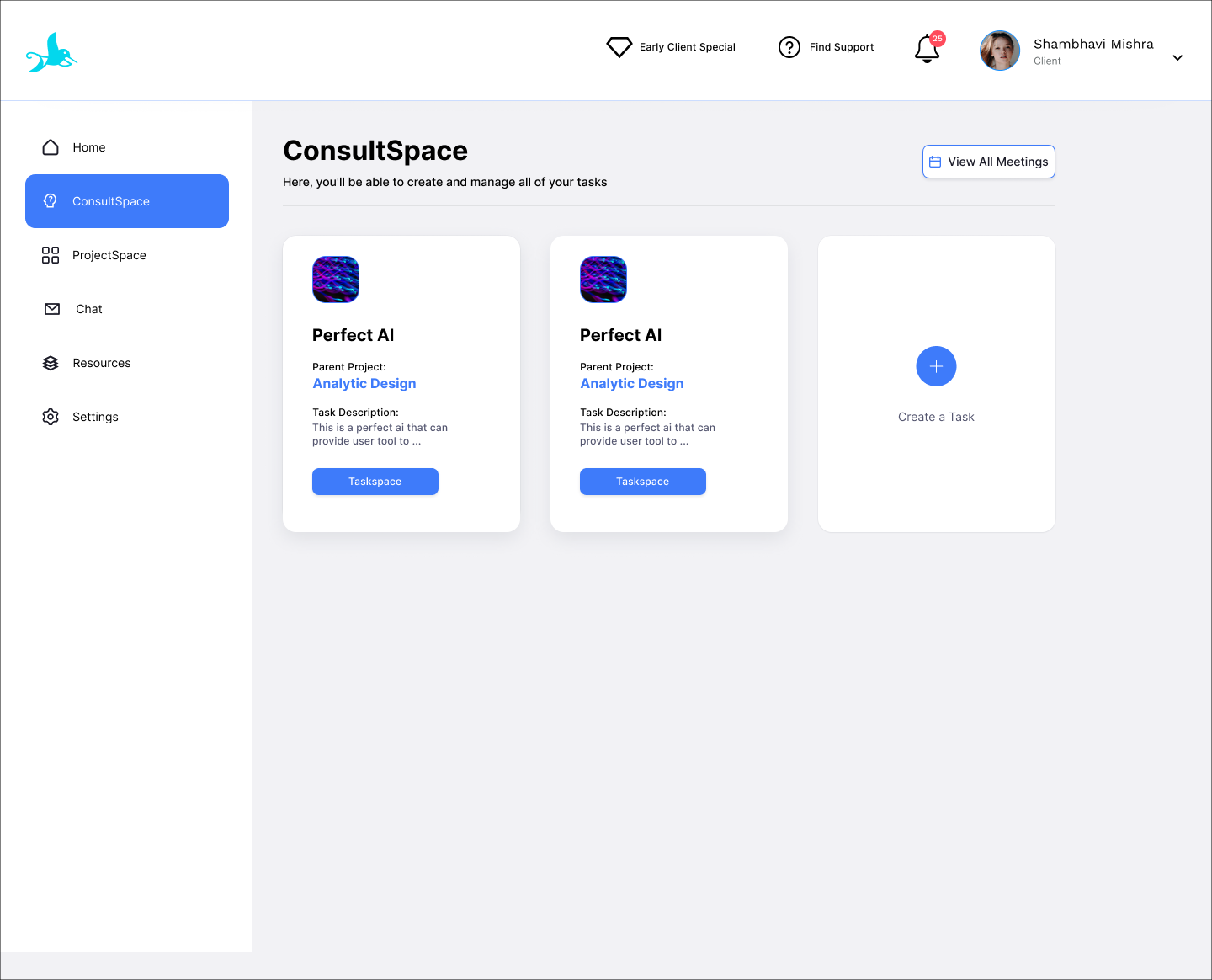
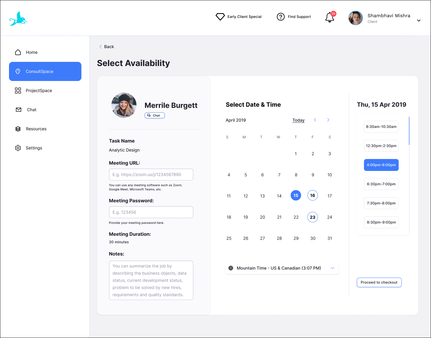
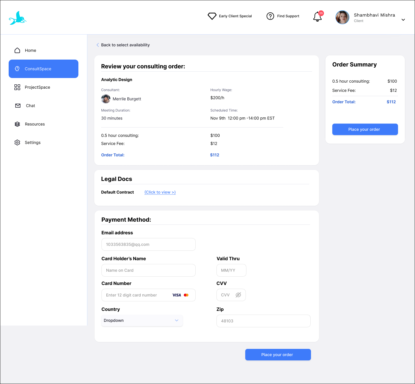
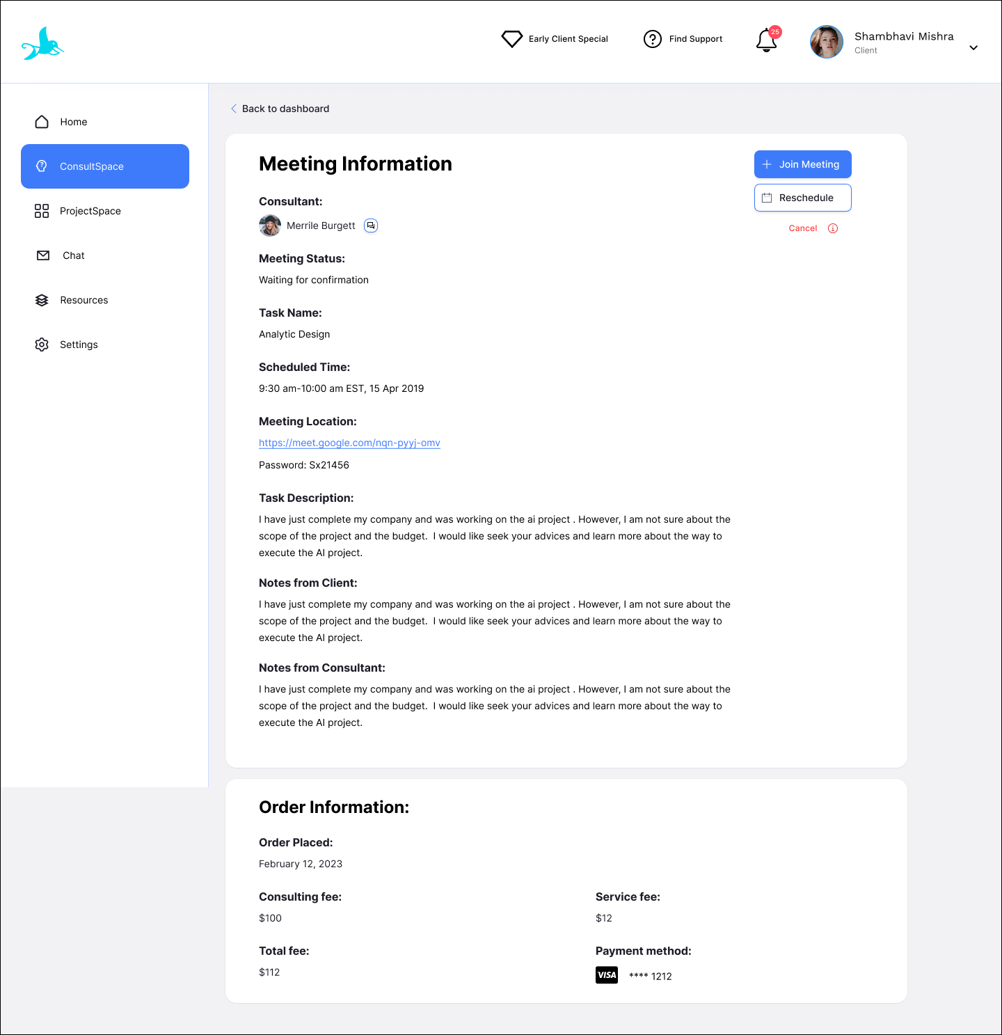
For client: Main user flow (Book meeting)
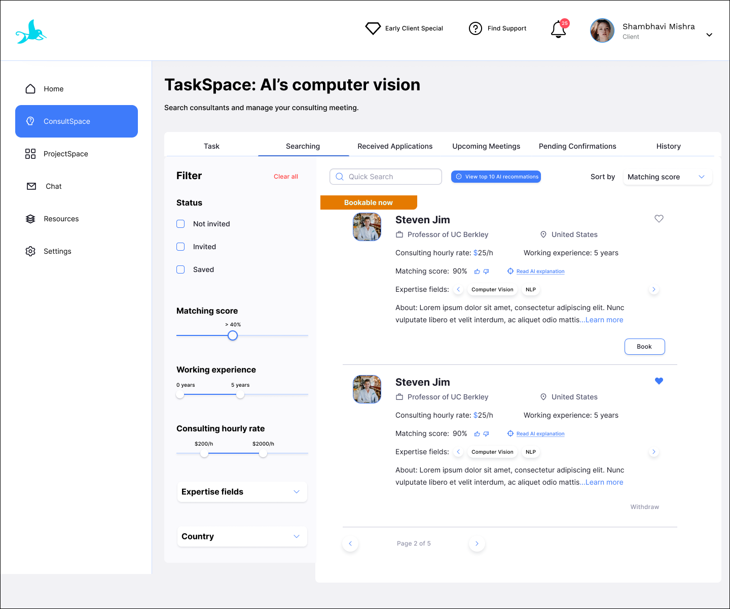
Search in TaskSpace
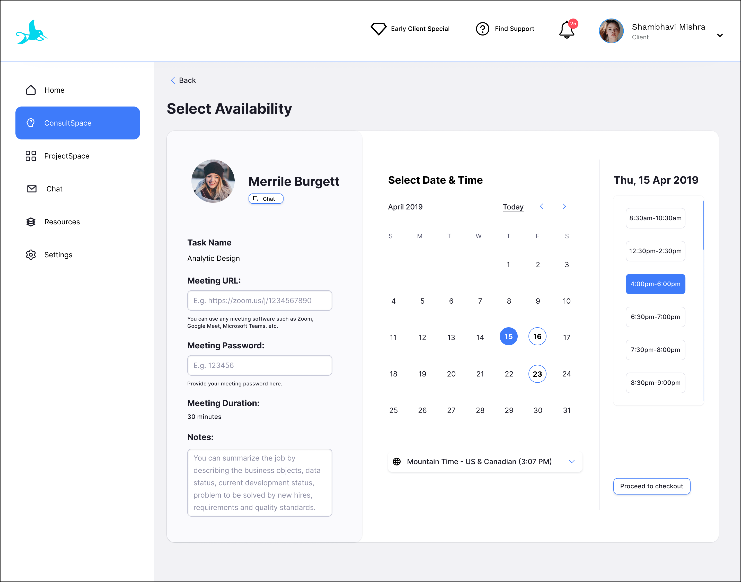
Select availability
Pay consulting order
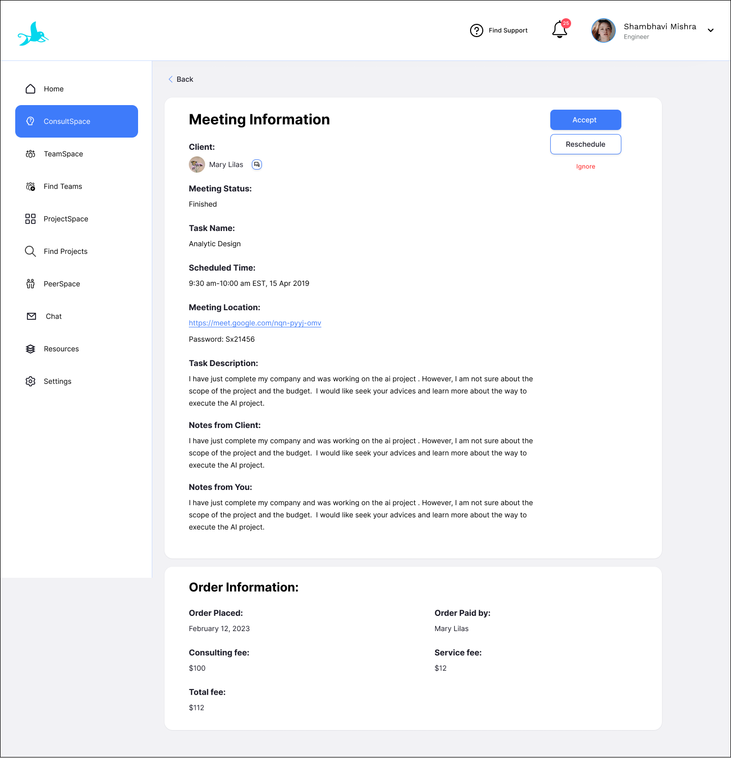
Confirm meeting


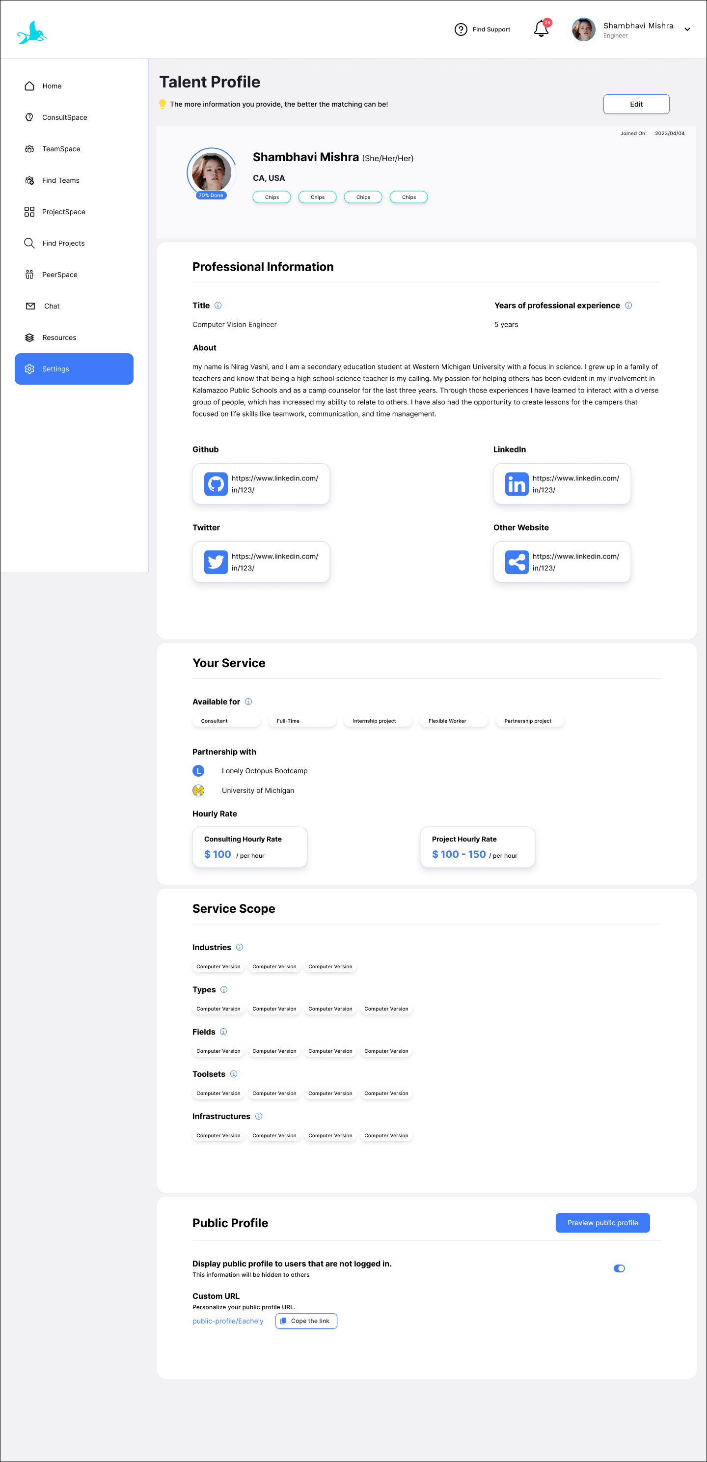
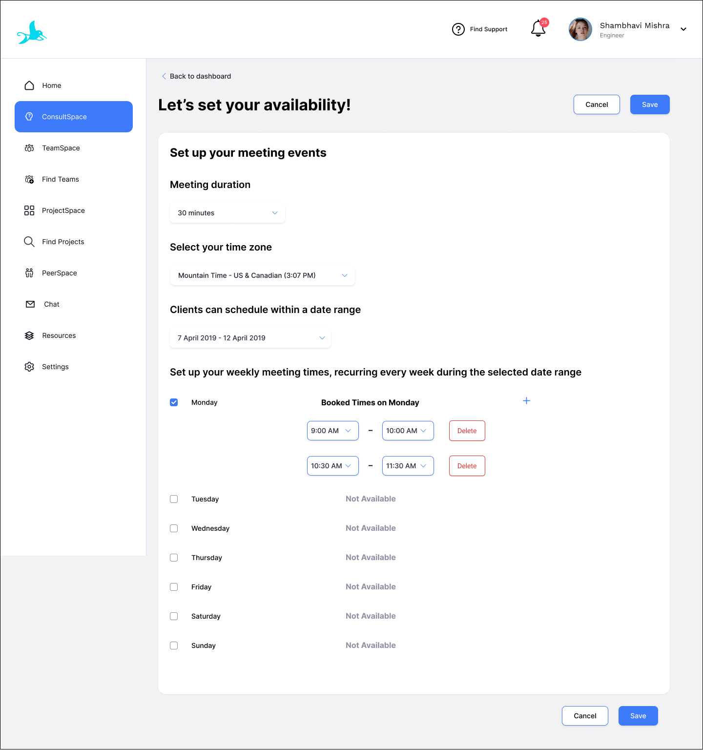
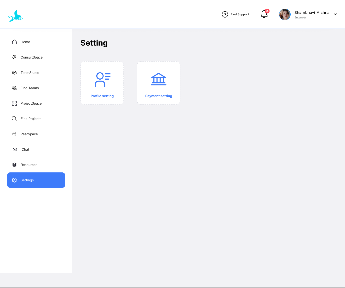
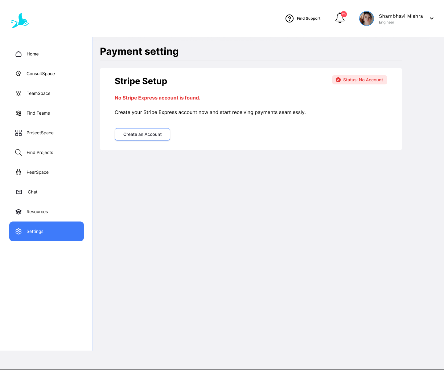
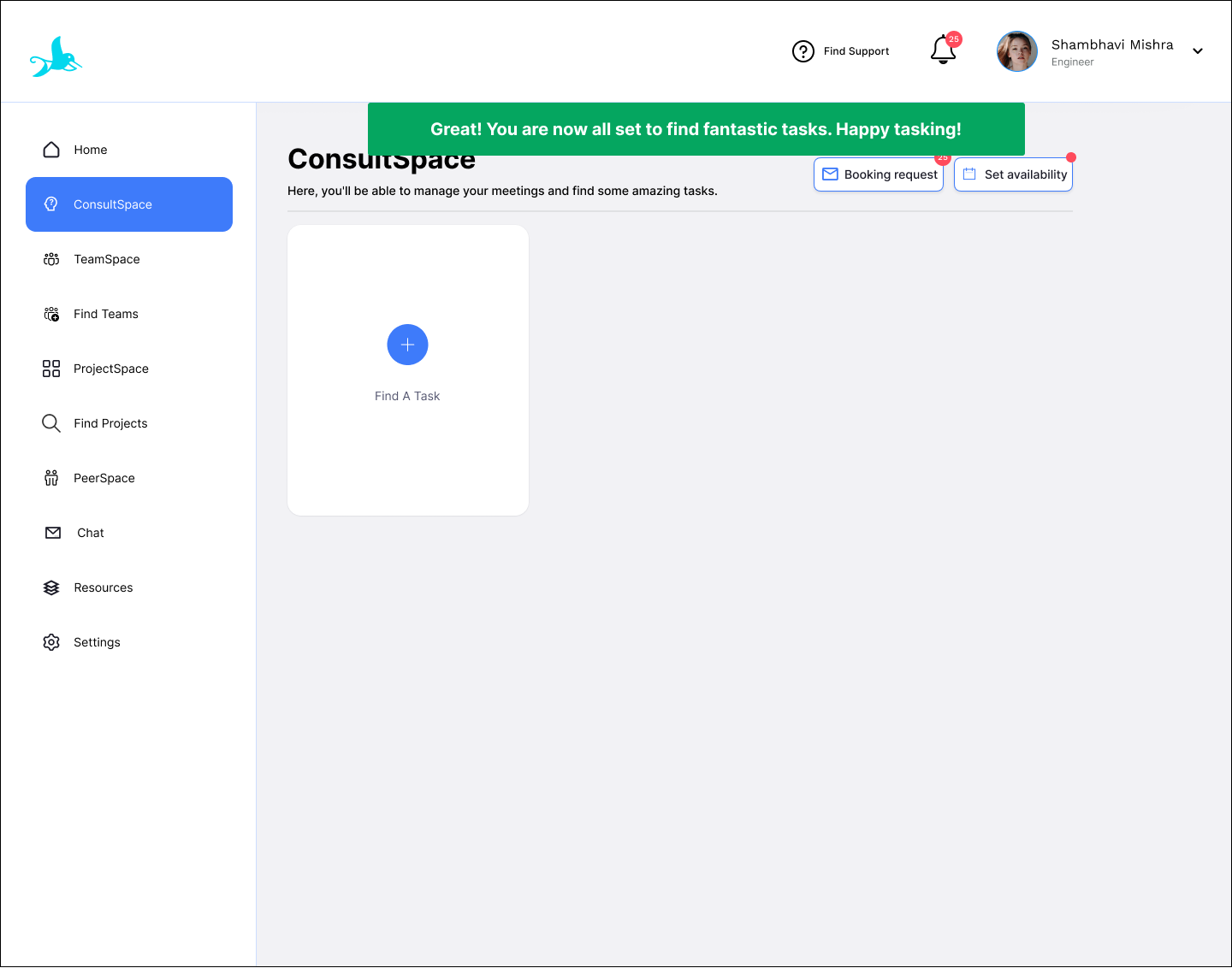
For consultant: Main user flow (Set up account and apply for consulting task)
Set up Consulting Hourly Rate in the Engineering Profile Setting
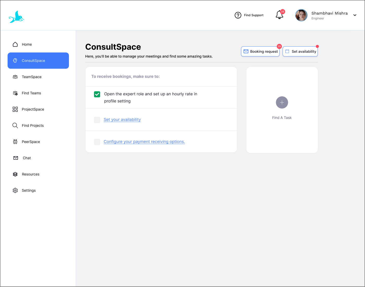
Set availability
Set up payment receiving options in the Payment Setting
Search in TaskSpace
Apply for a task
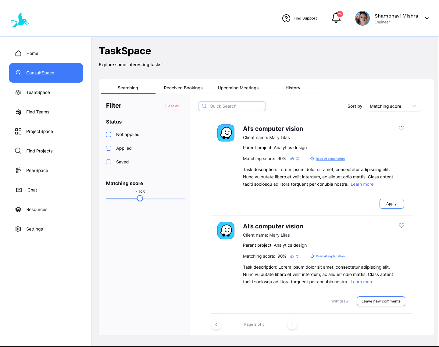
Confirm meeting


User Testing and Launch
USER TESTING
I spearheaded user testings with 120 users to see if current design has any problems. Usability testing methods include: moderated testing, unmoderated testing, a/b testing, guerilla testing, task analysis, first-click testing, Heatmap. Main takeaways of learning from usability testing are:
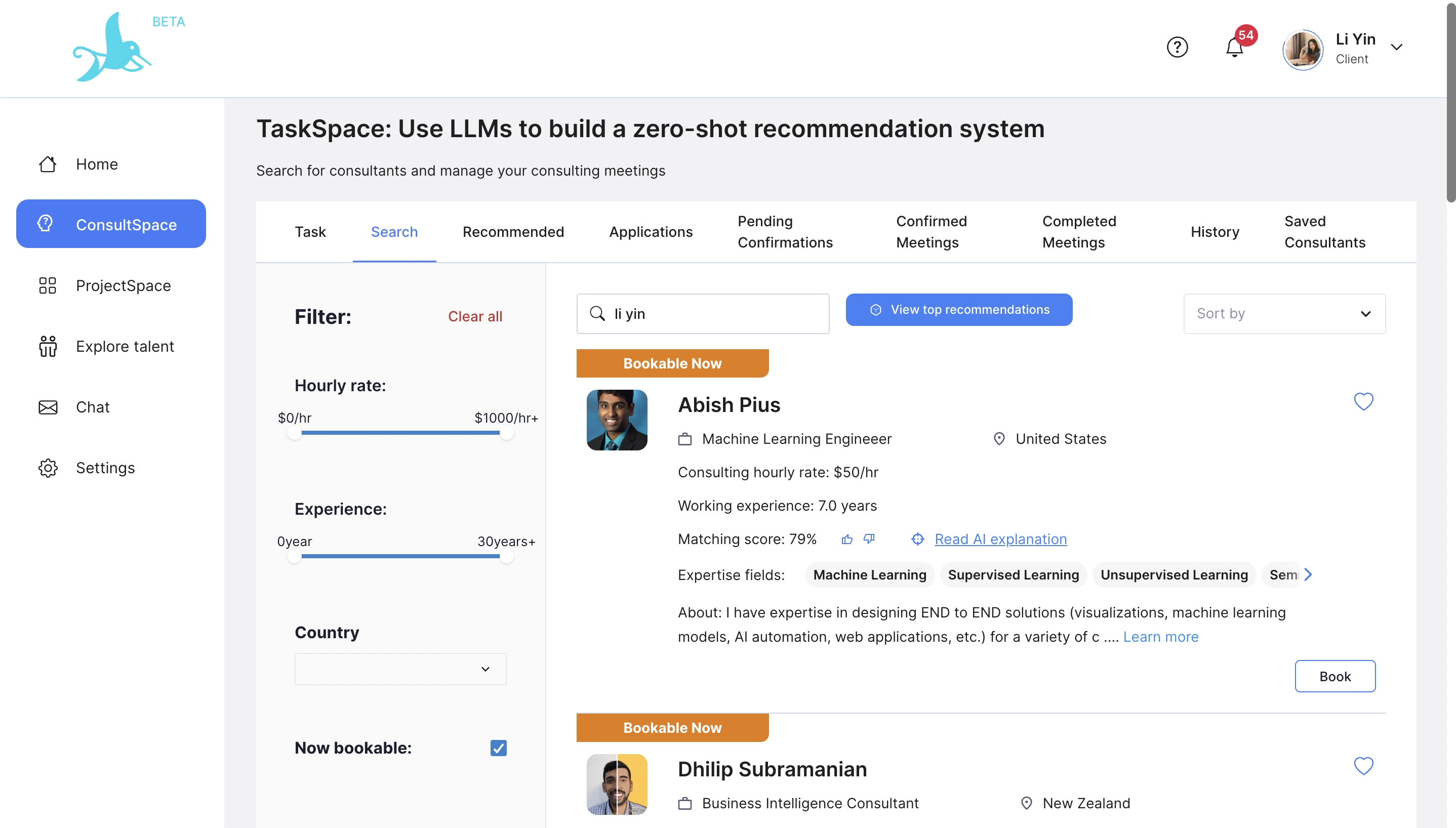
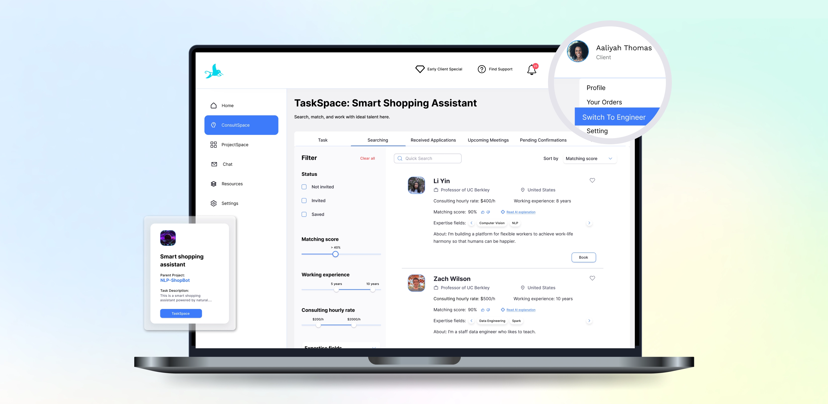
1. 82% of users think the role switching is redundant. According to Maze, users spent 8 seconds on average to switch roles in order to find a single feature, such as checking availability.
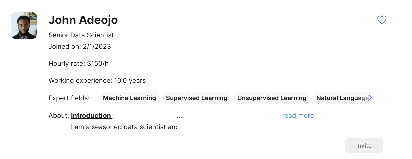
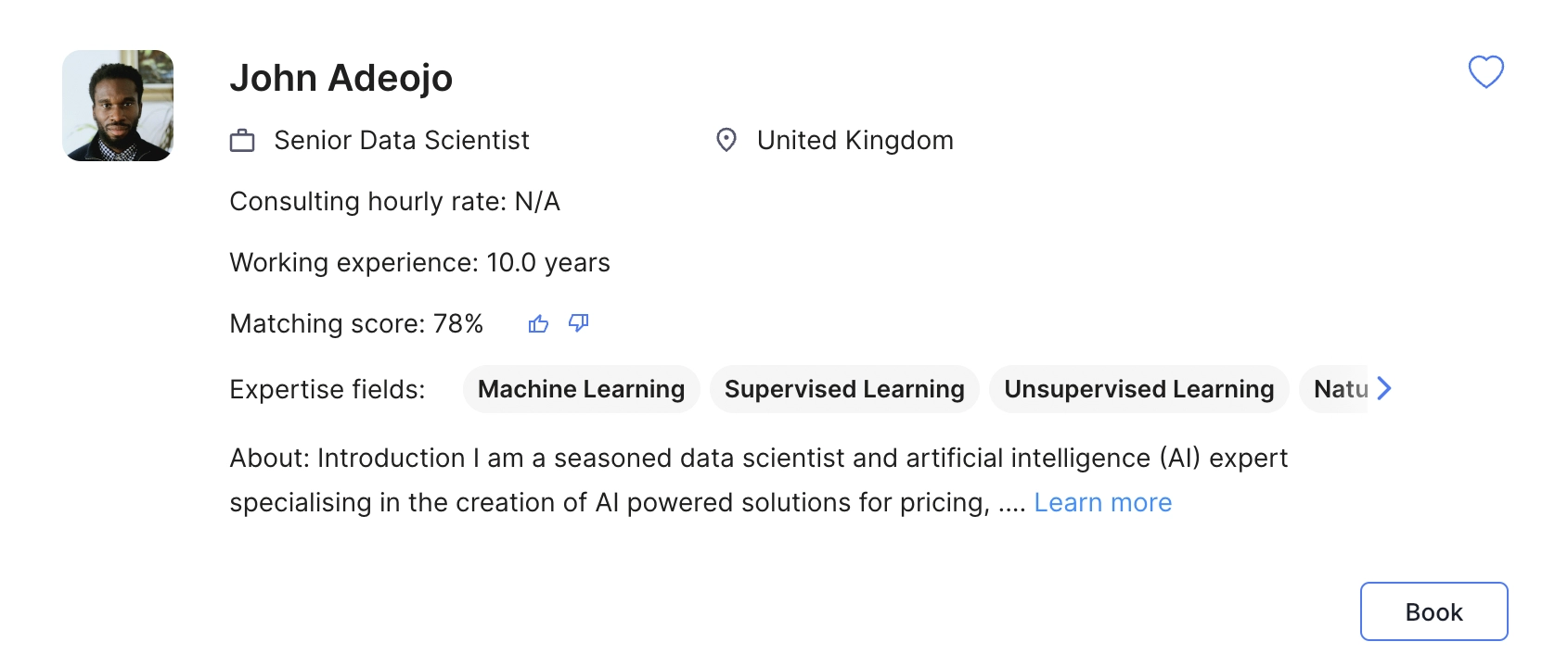
2. 96% of users only clicked ConsultSpace once to succesfully book a consultant, which reflects that the main menu is not a frequently interactive place for users. Moreover, according to the survey to 53 clients, 45 of them think the horizontal consultant card can show more information if possible.
ITERATION
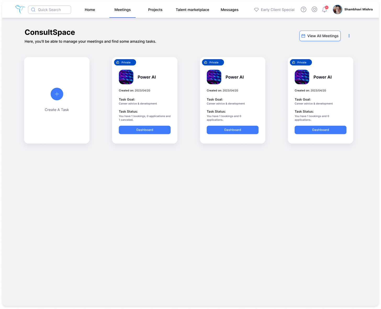
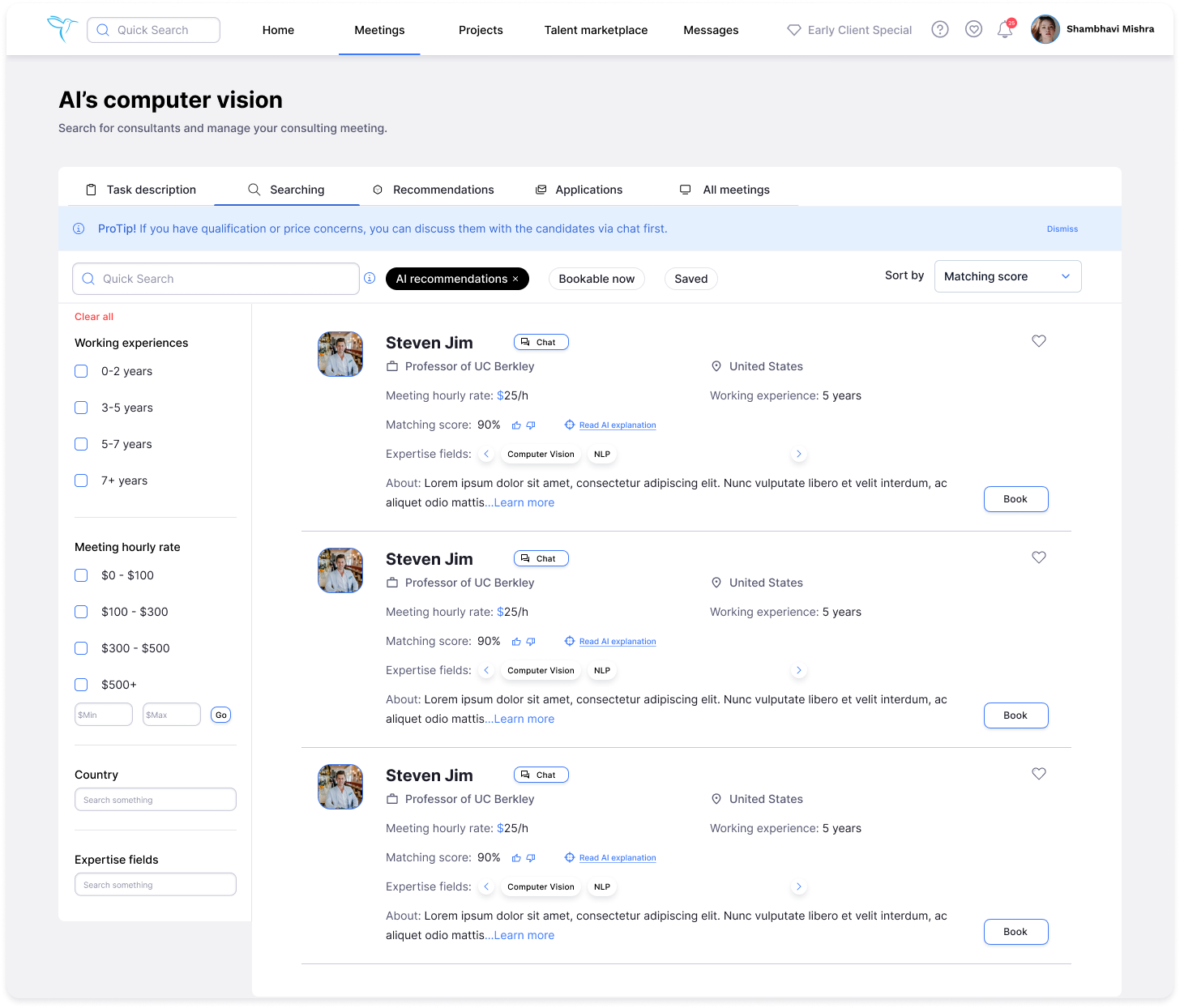
Main change in this iteration:
1.Merge engineer and client mode. No switch roles any more.
2.Merge 3 tabs: upcoming meetings, pending confirmations and history into one tab called all meetings.
3.Move the main menu from the sidebar to the navigation bar.
1.Merge engineer and client mode. No switch roles any more.
2.Merge 3 tabs: upcoming meetings, pending confirmations and history into one tab called all meetings.
3.Move the main menu from the sidebar to the navigation bar.
Story behind tab merging: The way I made tabs merging align with the data set and user's understanding is: I communicated with the developers to comprehend their data structure. Based on the new understanding, I revised the tab labels to ensure user-friendly comprehension and facilitate development.
LAUNCH
I finished design documentation and quality assurance, then work with our engineering team to implement the design. After the implementation, I conducted user testings again to let the people who join the user testings to walk through the design to complete each task, point out anything they like and dislike, and provide feedbacks accordingly.
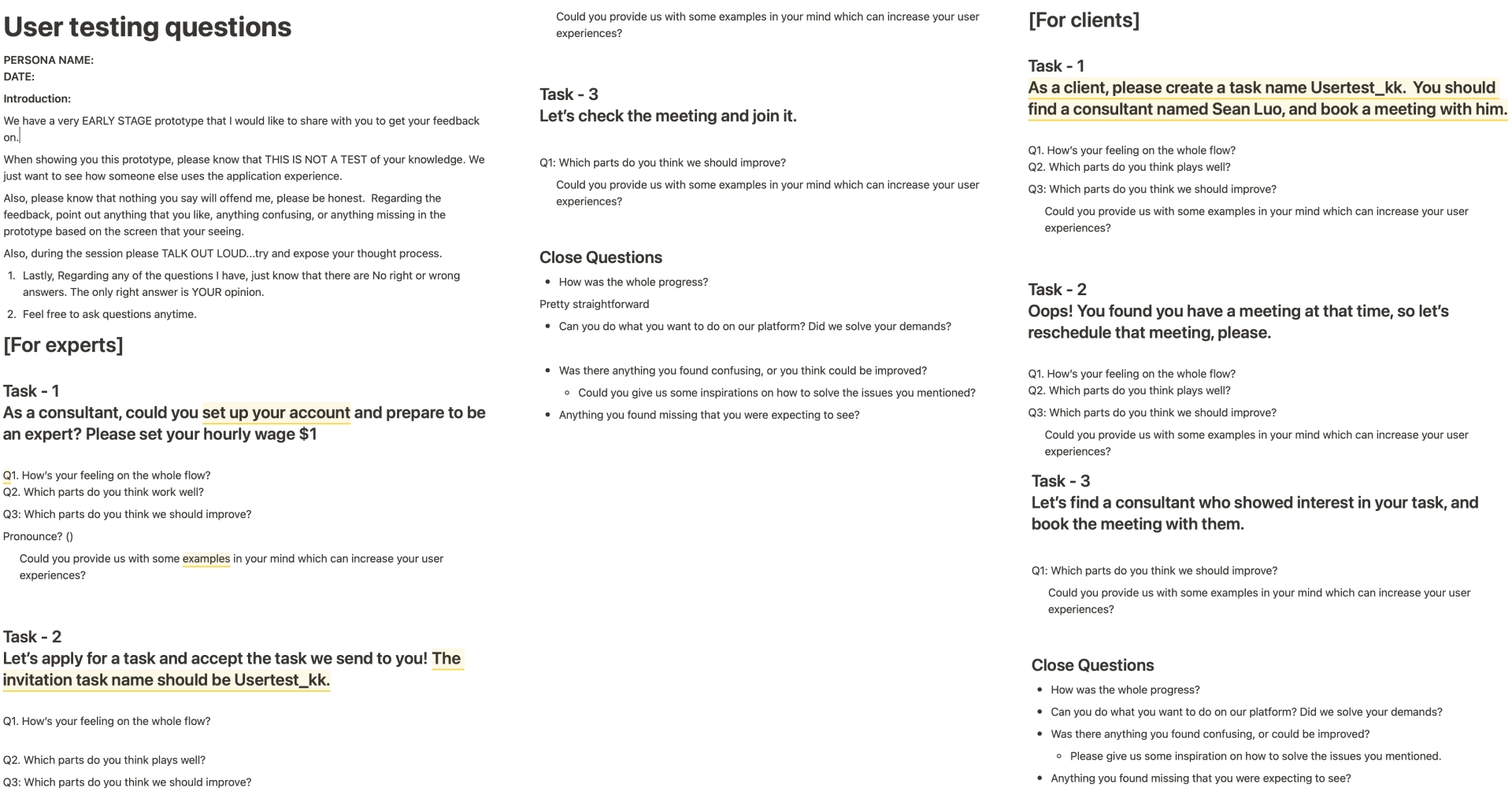
I enhanced the design and reported these bugs, user frustrations, and differences between design and implementation to the engineering team in order to perfect the user experience. ConsultSpace is eventually launched on April 25, 2023. Click "www.sylphai.com" to view the ConsultSpace real product.
METRICS
For User:
Engagement and retention lift after ConsultSpace launch.
Increase in number of new meetings after ConsultSpace launch.
Increase in daily active users after ConsultSpace launch.
OUTCOME
Design System
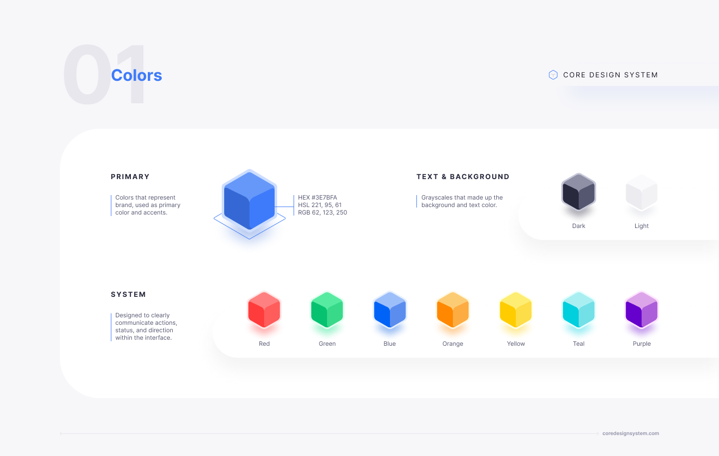
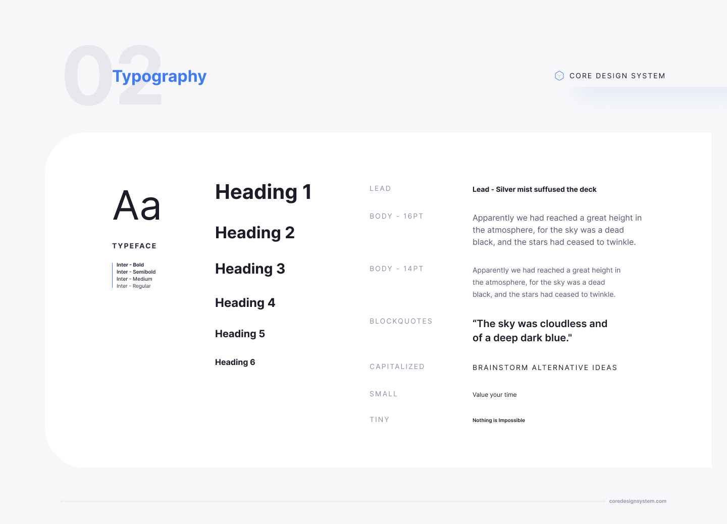
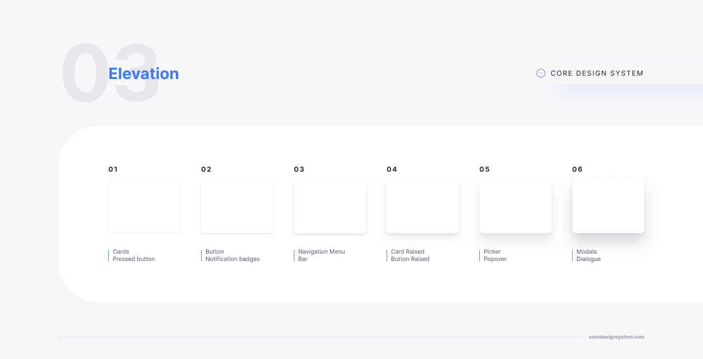
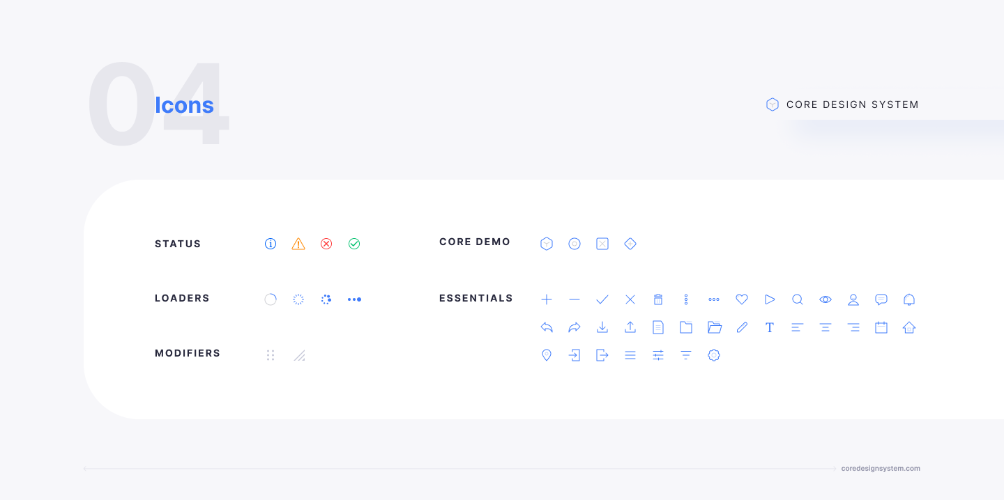
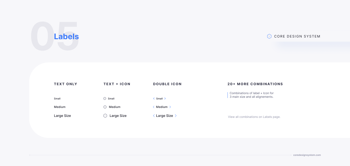
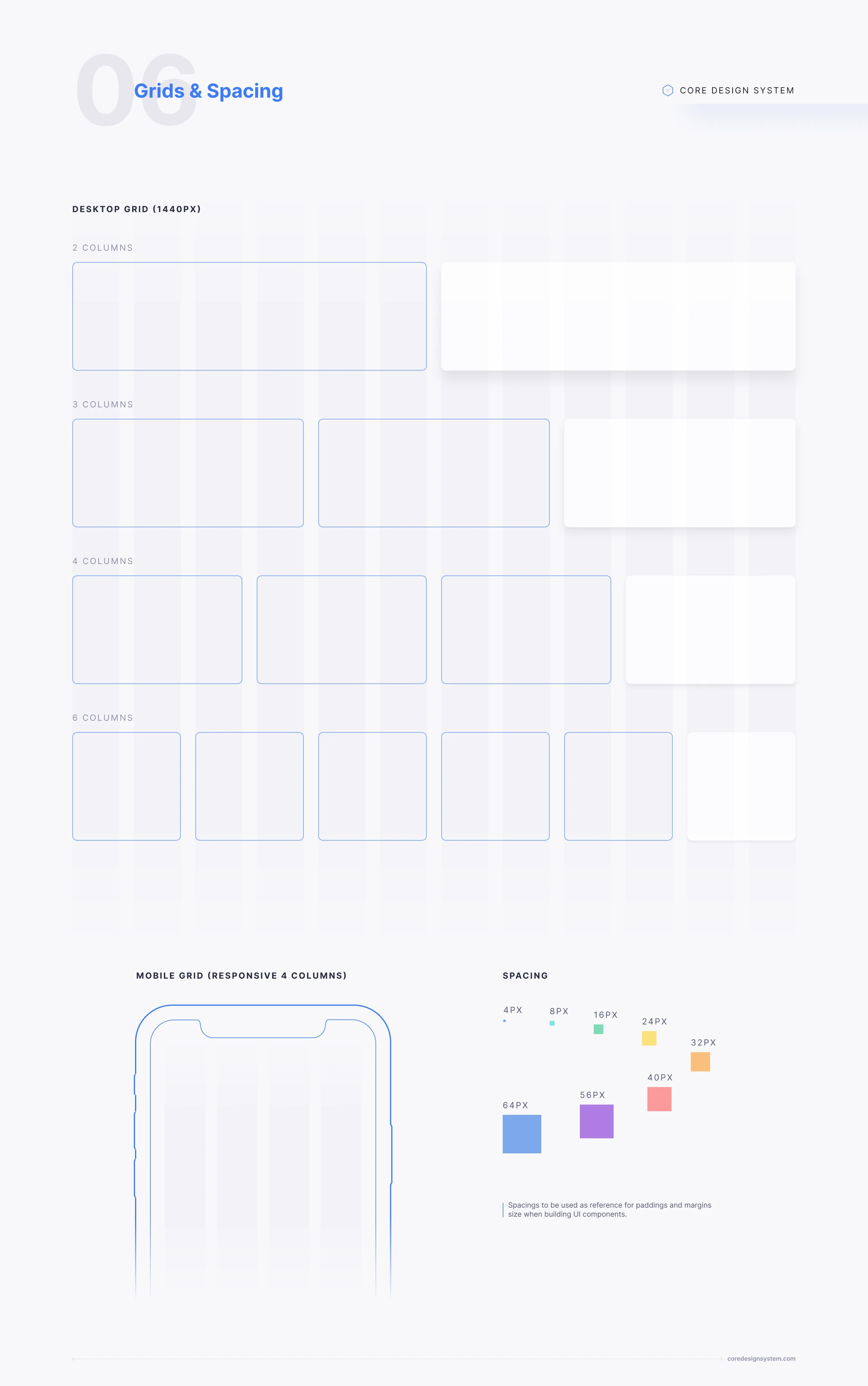
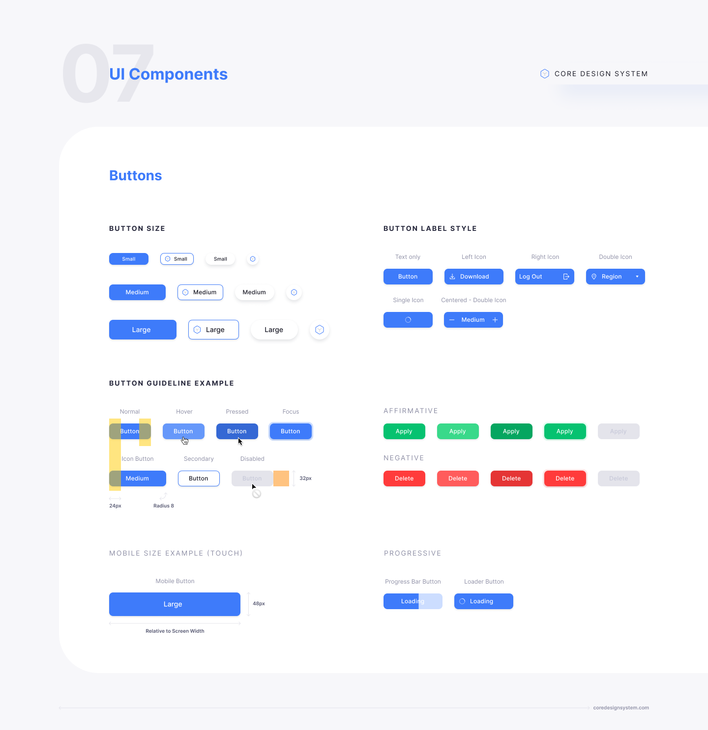
I made the design system of SylphAI including colors, typography, elevations, icons, labels, grids, spacing, UI components.
Marketing
ConsultSpace Launch Graphics
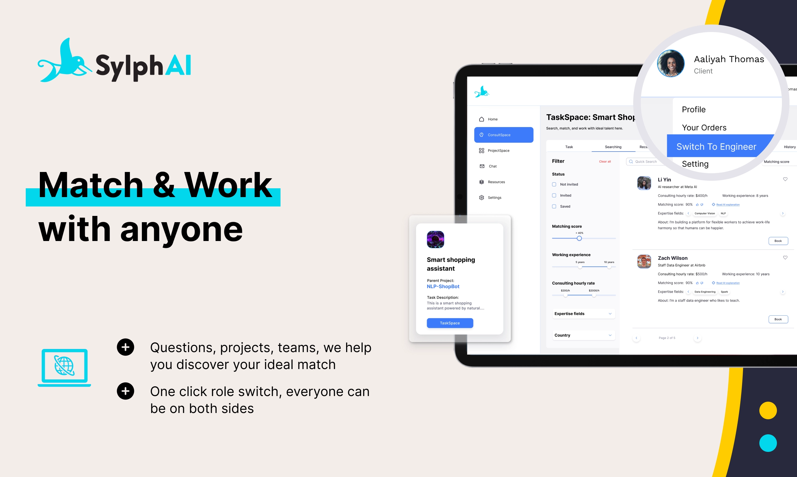
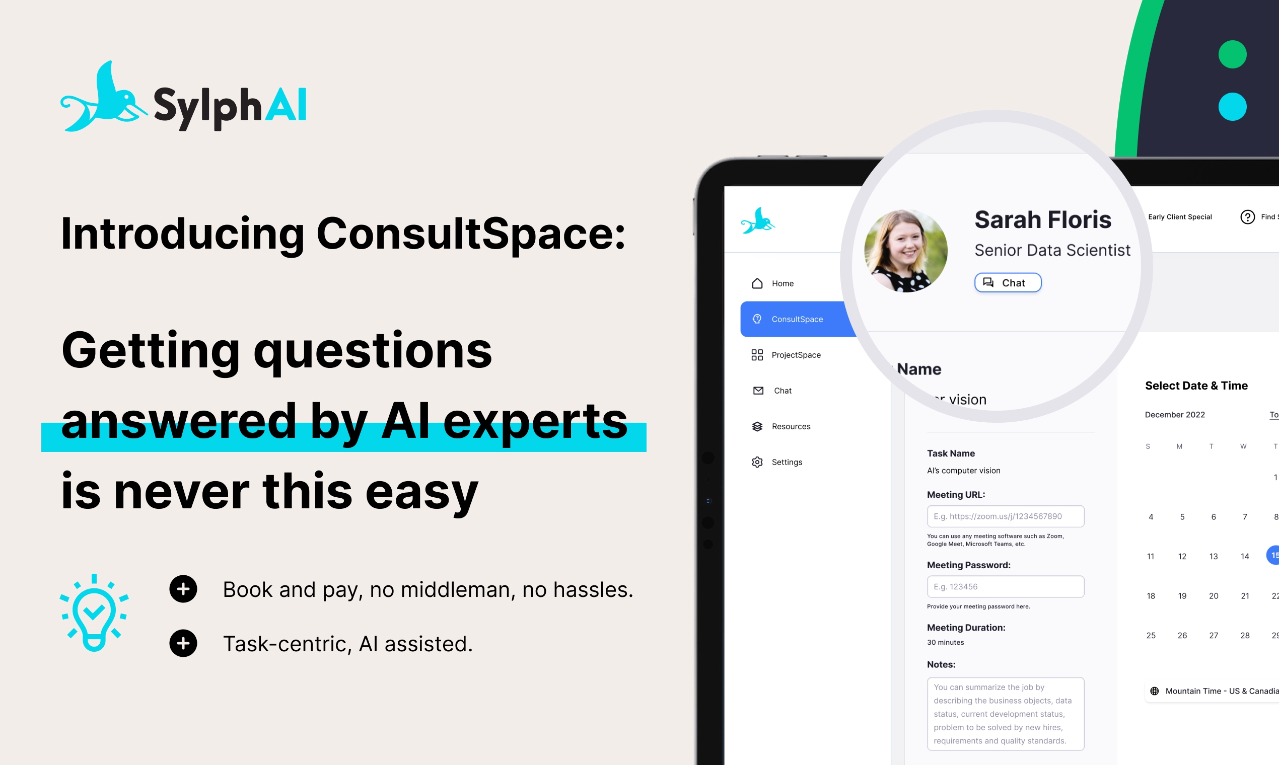
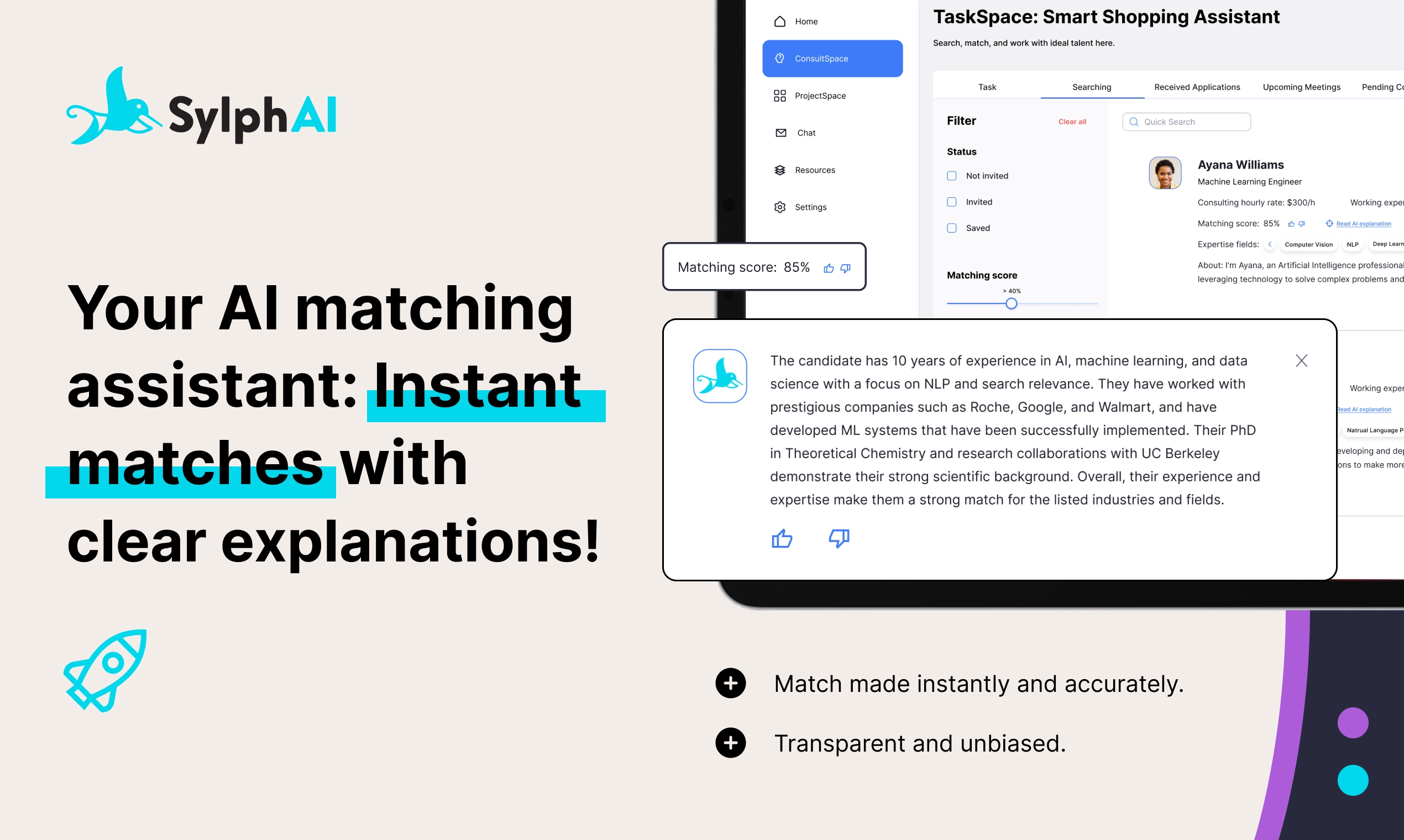
I designed the ConsultSpace launch graphics to introduce ProductSpace product on LinkedIn, twitter, blog, community.
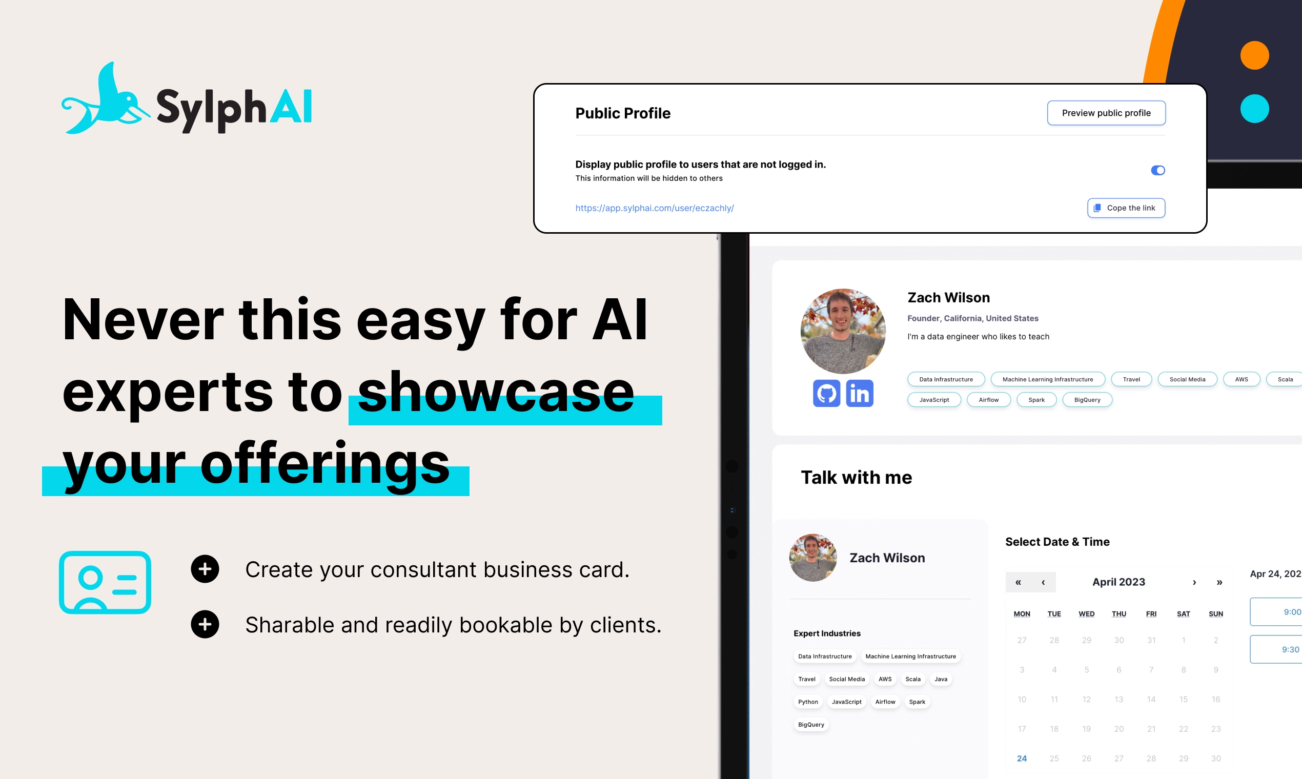
Landing Page Design
I designed the landing page and worked with engineers to implement the design.

Banner Design
I designed the LinkedIn banner.

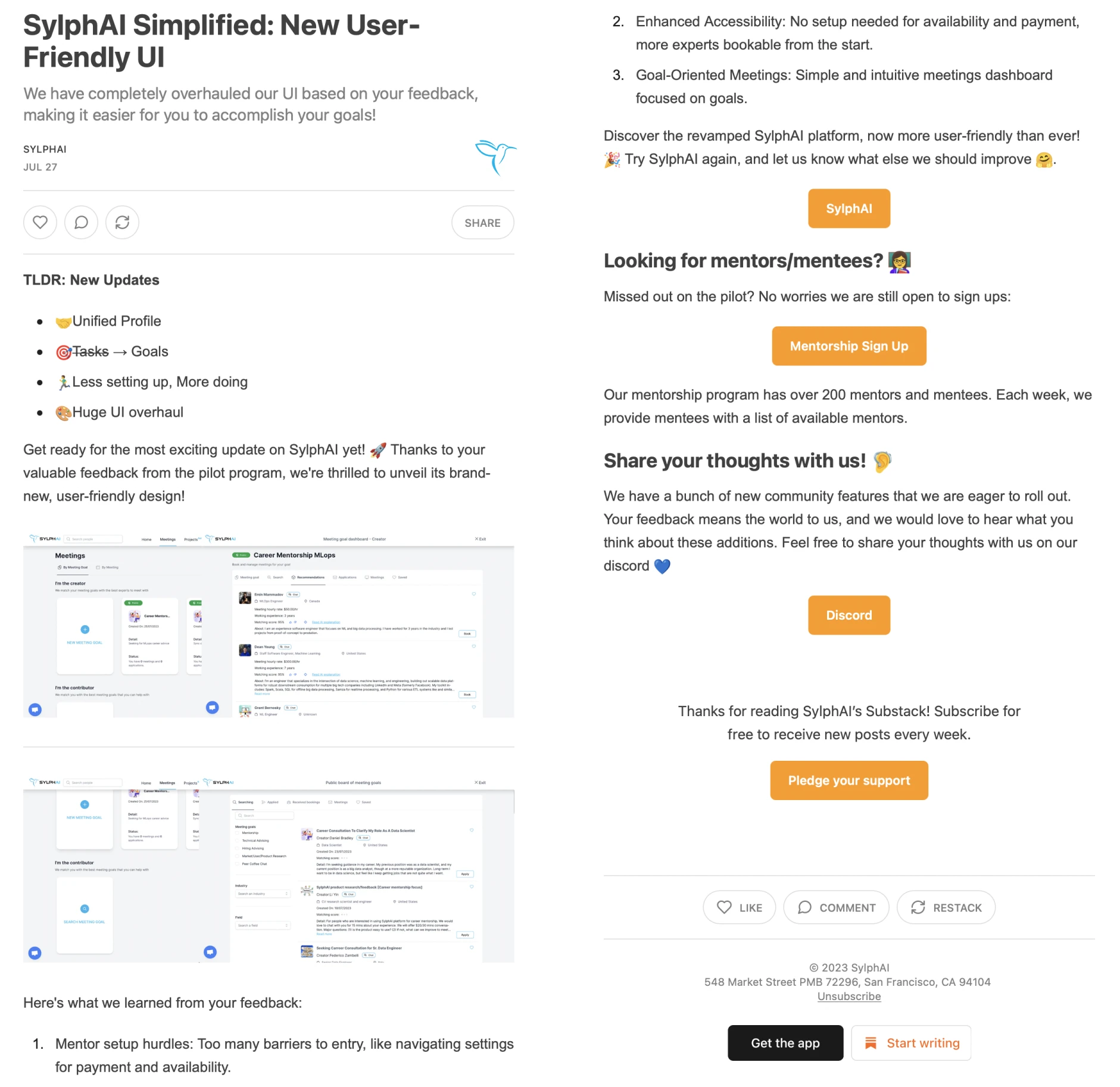
Email Marketing
I designed visually appealing email templates by Mailchimp to support email marketing campaigns.
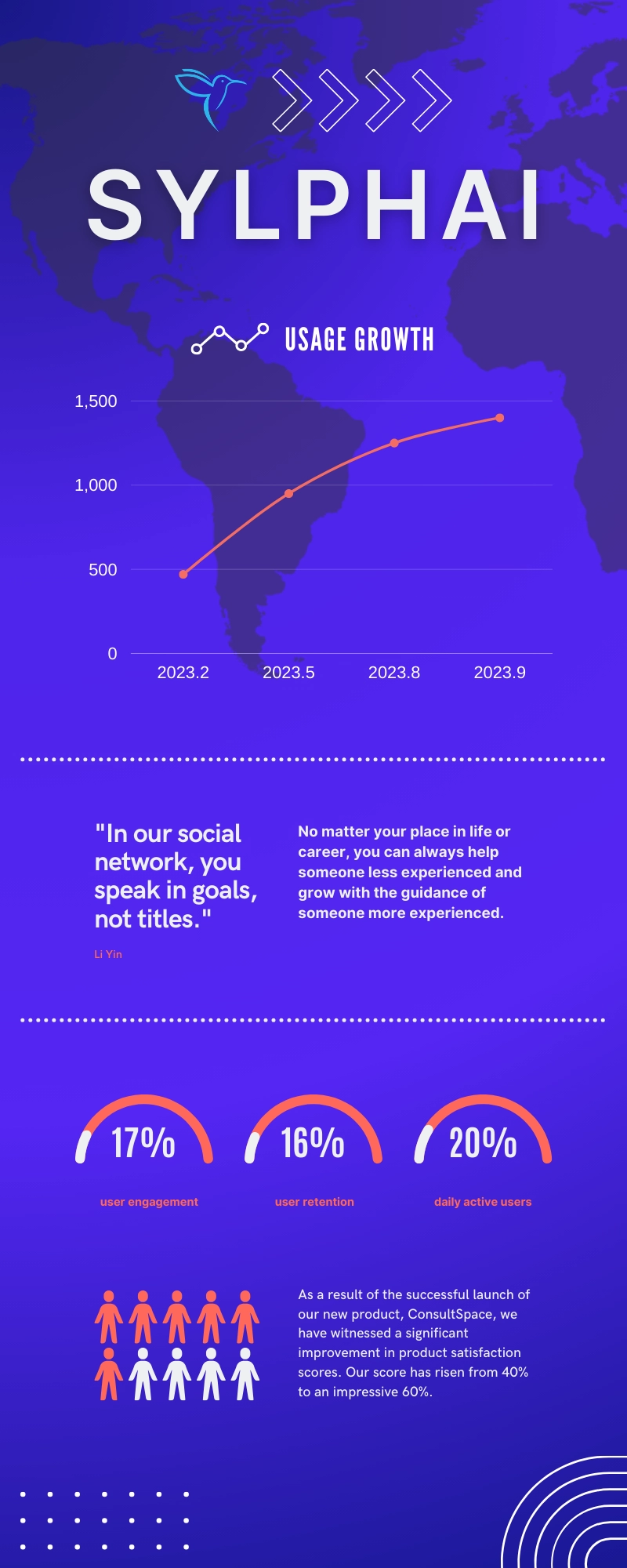
Infographics
I created visually captivating infographics to enhance marketing initiatives.
B2B Solutions
I designed the students dashboard and partners dashboard for our client NUS National University of Singapore.
Demo Video
I worked on the motion graphics and video editing for the demo video.
Reflection
What I have learnt from the design process of ConsultSpace?
Overview
Edge cases
Consistency and quick implementation
User experience
Documentation
No perfect design
EDGE CASES
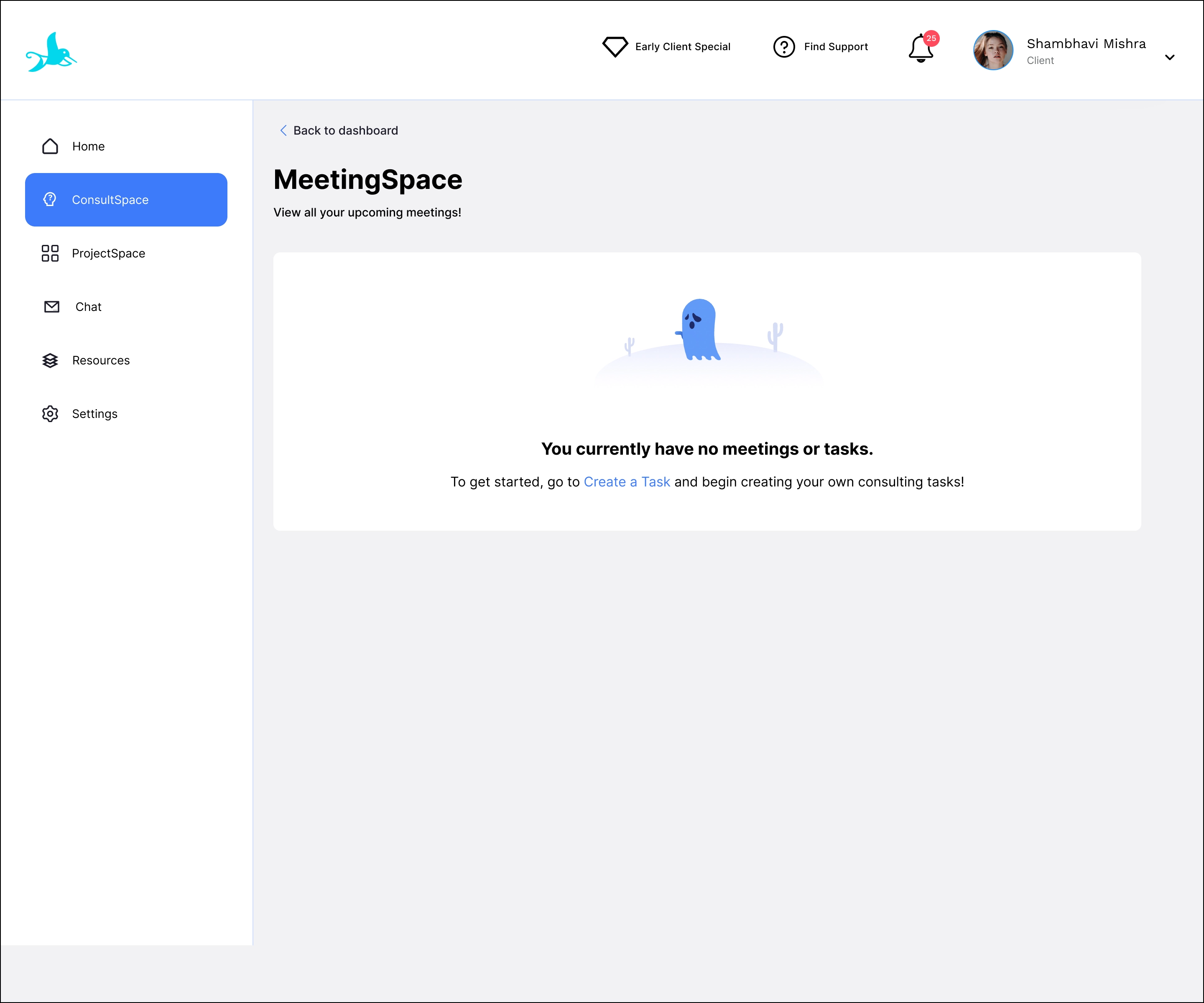
At the beginning of the design, I spent most of the energy to focus on the main user flow and neglect the edge cases. The edge case is a scenario that is less likely to occur, but it still exists!
I also realized that if I as the designer didn't provide the user interface design of edge cases for engineering team, then they will just implement it in a functional way and it finally turns out to a fully low-wireframe looking because they are lacking of design guidance.
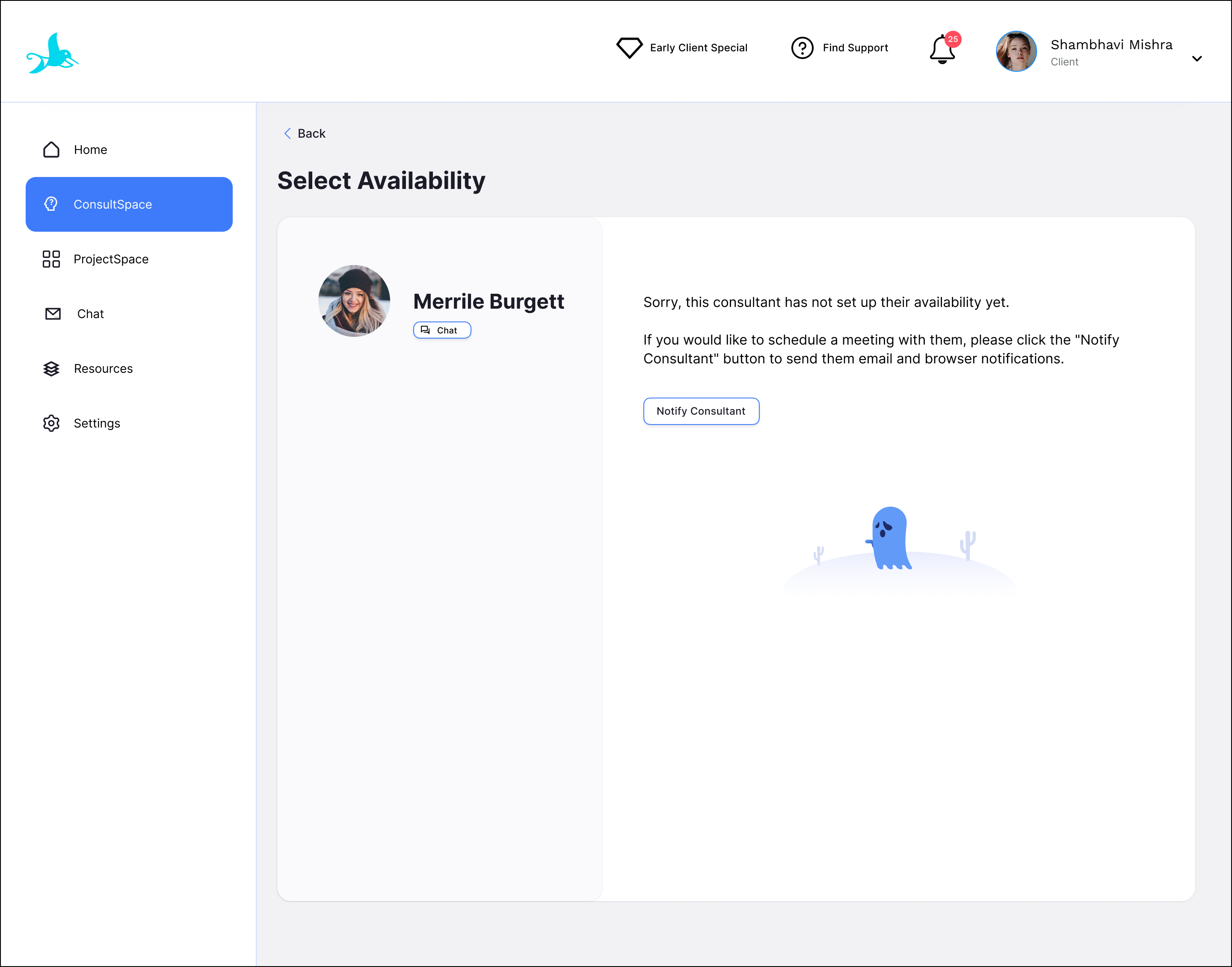
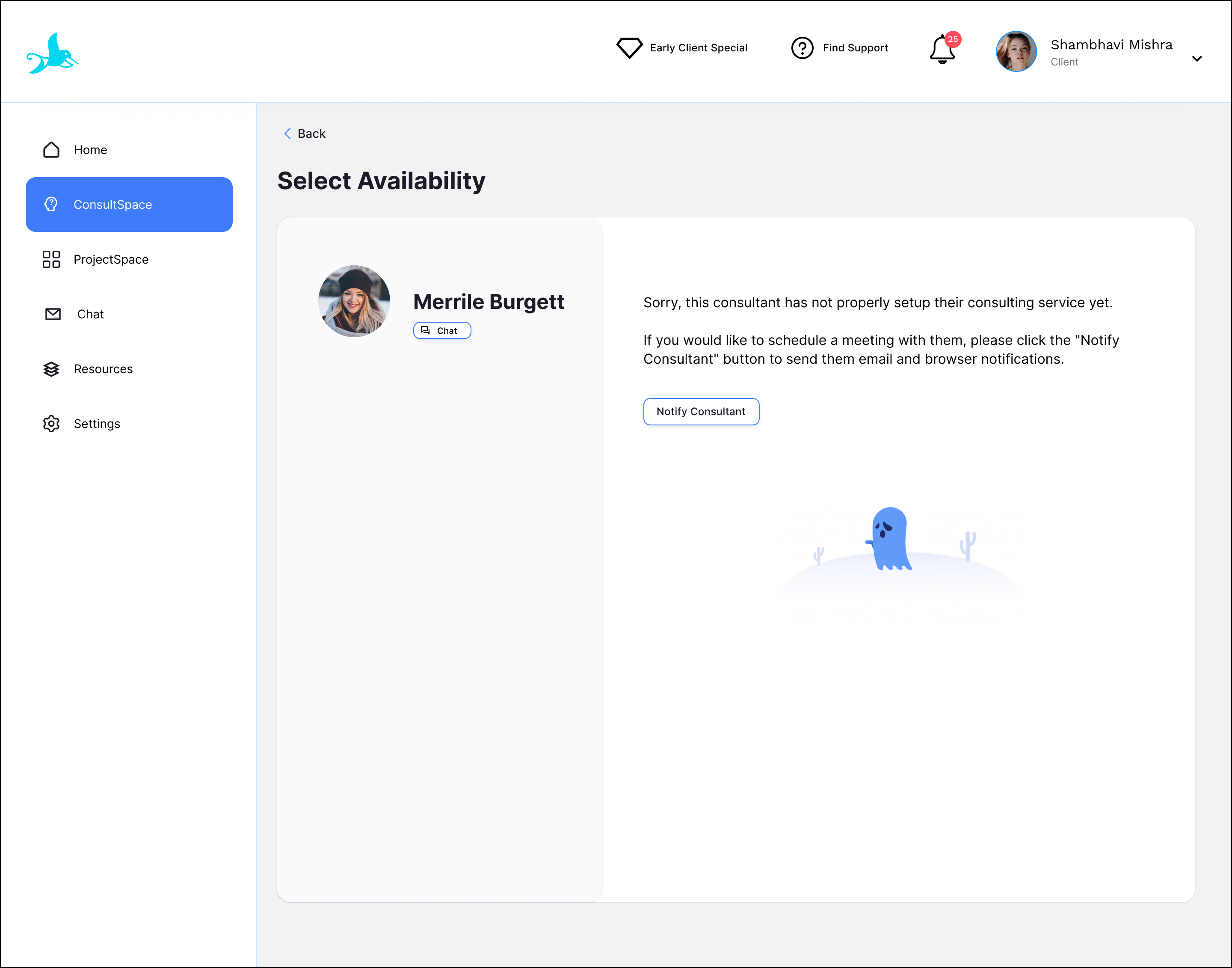
Client: Notify consultant to set availability
Happy path
Edge case 1: This page appears when the consultant has not setup their availability yet.
Edge case 2: This page appears when the consultant has not properly setup their consulting service yet.


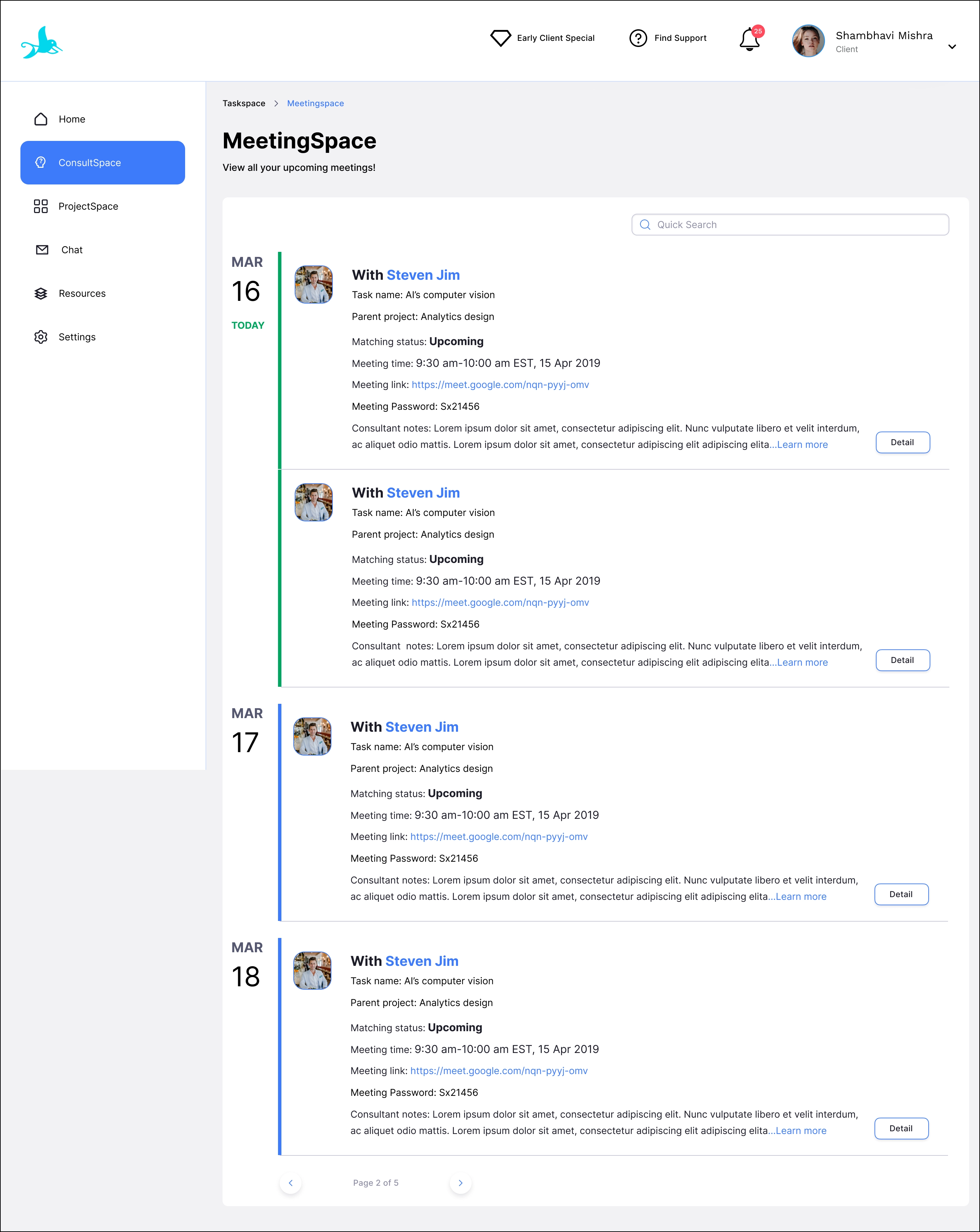
Client: View all upcoming meetings in MeetingSpace
Happy path
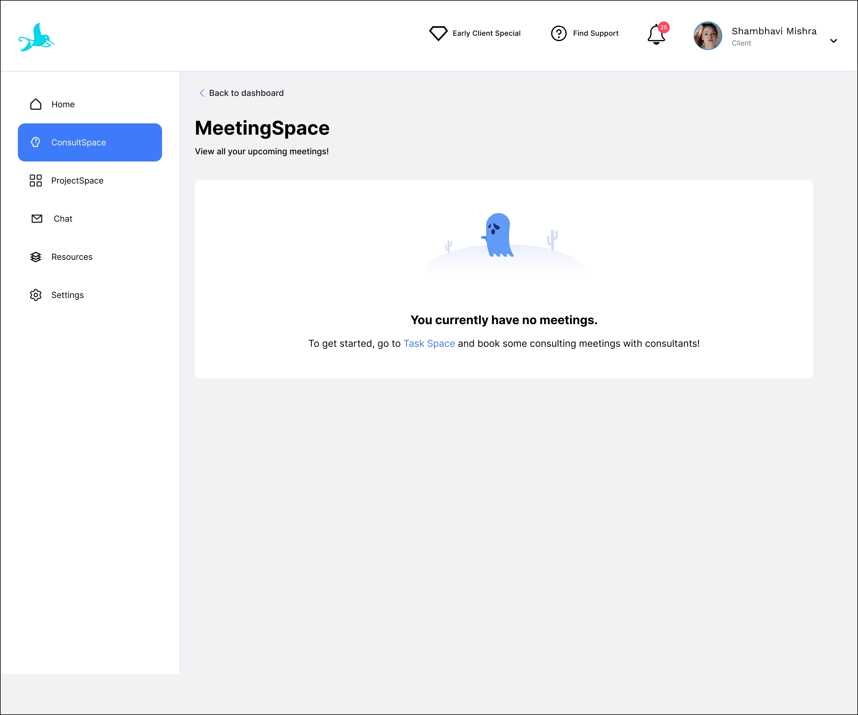
Edge case 1: This page appears when the client has tasks but no meetings.
Edge case 2: This page displays when the client has no tasks or meetings.


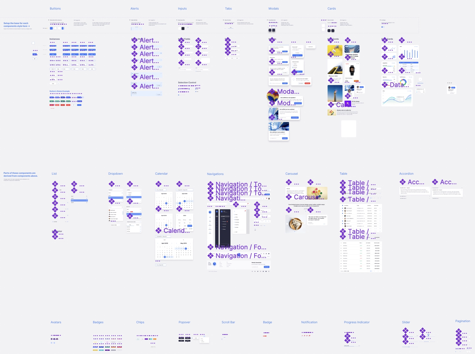
CONSISTENCY AND QUICK IMPLEMENTATION
Working in fast-pace startup, I learnt that component re-usage is a good way to design quickly but still align with the design system.
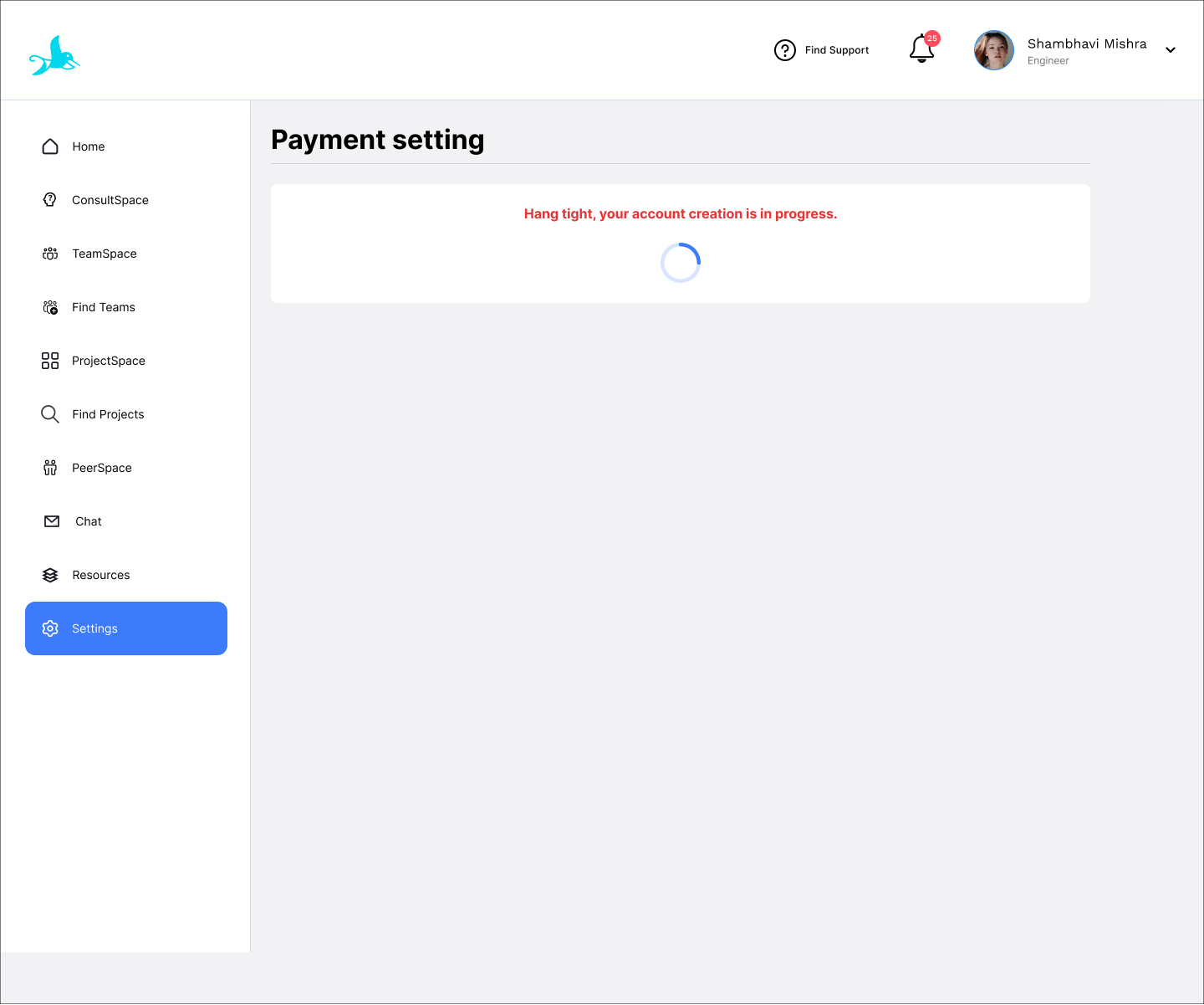
USER EXPERIENCE
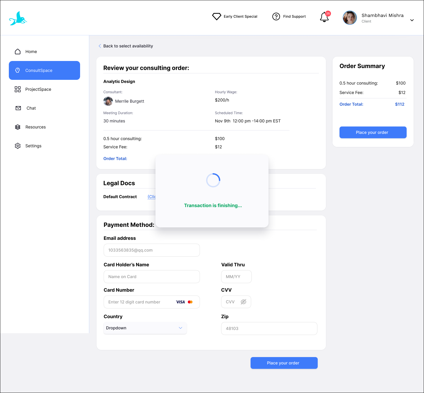
Some problems are hard to find during the design process, but easy to find in the real product. Therefore, I used the real product by myself and did the user testing to learn where the user experience is bad.
For instance, sometimes the loading time is too long and user might not have the patience to wait, so I as a designer should enhance this user experience and design the user interface of loading status and add call-to-action.
DOCUMENTATION
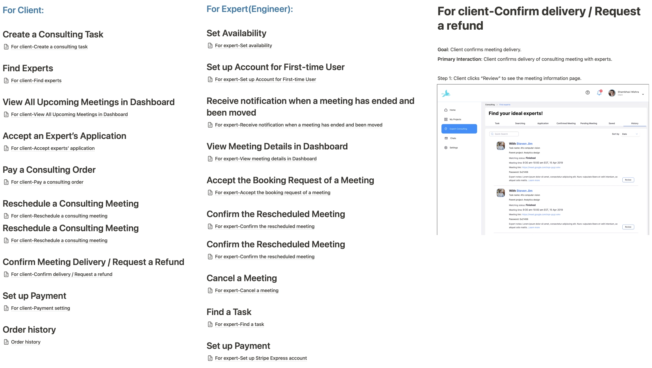
UX documentation is important for engineering team to understand the flows and scope the project. I learnt that in the UX documentation I should clearly explain differences between the latest iteration and last version, also the logic of each user flow.
NO PERFECT DESIGN
After the official launch, I still found some problems and worked on the design accordingly. We have the MAKE 100 CLIENTS HAPPY plans and constantly talk to users to receive their feedbacks. I learnt a lot from the users and the launched products.
By using the launched product, I realized a pain point that there are so many consultants that did not set up their consulting service properly, which makes me annoying becasue it costs me so much time and effort to find the consultants that have completed their consulting service setup. Therefore, I added the badge to highlight the consultants who are bookable now and a bookable checkbox on the filter.
