Etsy Redesign
Date: Fall 2019, Time: 1 Month,
Role: UX Design, Team: Personal Project.
Role: UX Design, Team: Personal Project.
Introduction
As a frequent shopper, I prefer online shopping because it can be done anywhere. I don’t need to worry about mall opening hours, price comparison and waiting in lines. I just shop whenever I feel like shopping. I like online discounts as well. Online shopping has fewer distractions than onsite shopping. However, sometimes the online shopping experience fails to satisfy. I'm uncomfortable with the endless forms, hidden charges, advertisements and missing deliveries. I get stuck with a bunch of boxes filled styrofoam packing peanuts. The user experience of some online shopping apps is bad as well. Sometimes I can’t find what I want and get lost in the navigation. The user interface design is bad, which makes me feel dizzy while I am using the app. I like online shopping because it has fewer distractions, but sometimes I feel that I've gotten more distractions by choosing online shopping, which is disappointing.
CLIENT BACKGROUND
Etsy is an e-commerce app to connect people looking for unique goods with independent sellers around the world. Etsy is one of my favorite apps when shopping for special gifts for my friends. Small distractions can have big consequences, so I want to redesign the user flow and enhance the user experience of Etsy's shopper page. I want to create a whole new world for distraction-free online shopping.
PROJECT SCOPE
I was approached with the task of redesigning the front-end of the Etsy app. The app should allow users to easily understand and navigate, as well as provide a seamless experience when looking for unique goods. I identified emerging trends, and turned them into reusable patterns, then applied iOS system-provided interface elements, icons, text styles, and uniform terminology to innovative new features. I advocated for visual and behavioral consistency. Simply put, I created a seamless, simple, instinctive, and memorable experience.
Research
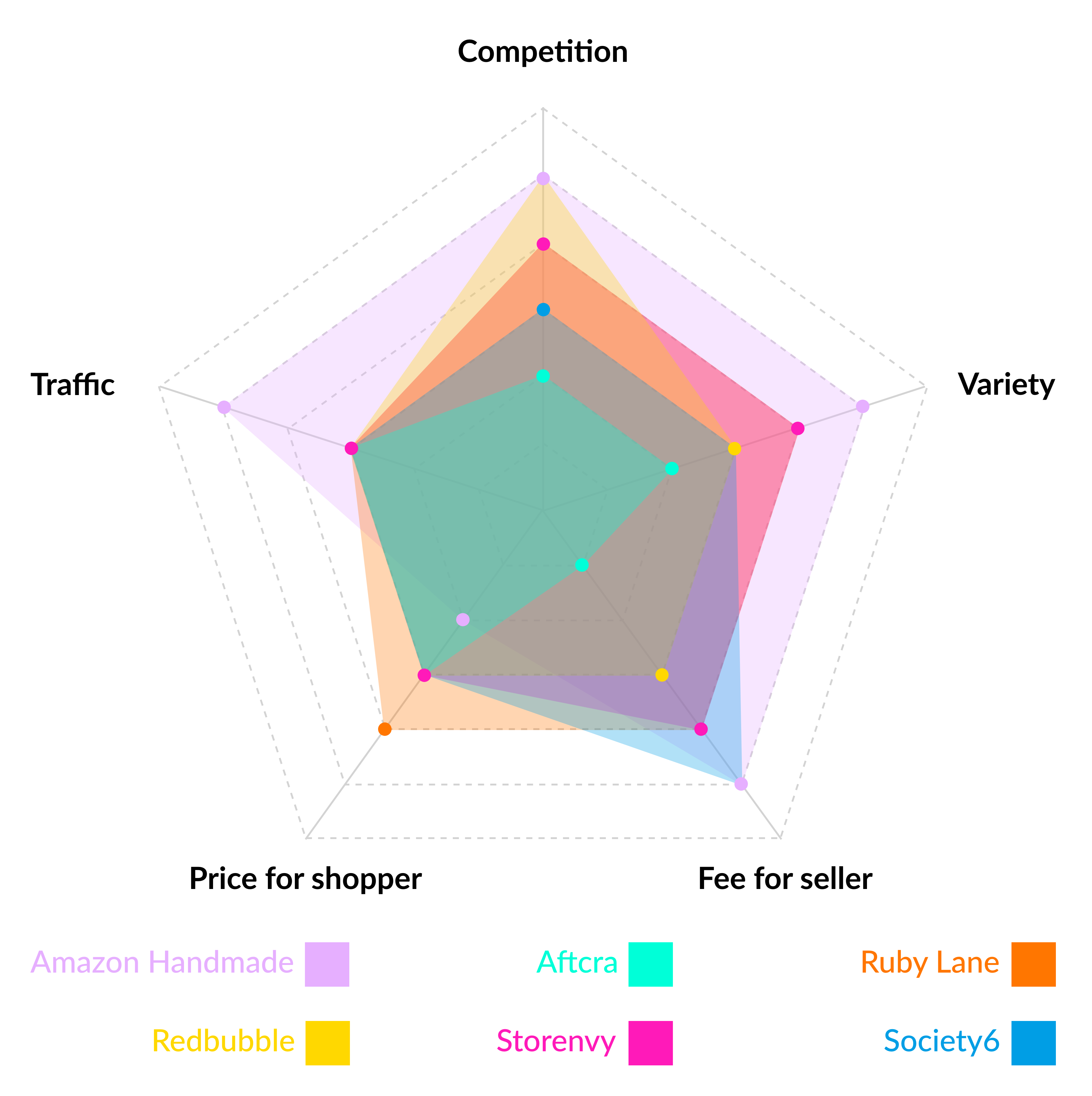
I began the project by conducting semi-structured interviews with Etsy users of different backgrounds in order to understand their search habits, product choices, struggles, user behaviors, and so on. I also conducted a competitive analysis with products related to the user group such as Storenvy, Ruby Lane, Amazon Handmade, Society6, Aftcra, Redbubble and others to understand the scope of existing solutions within this problem space.
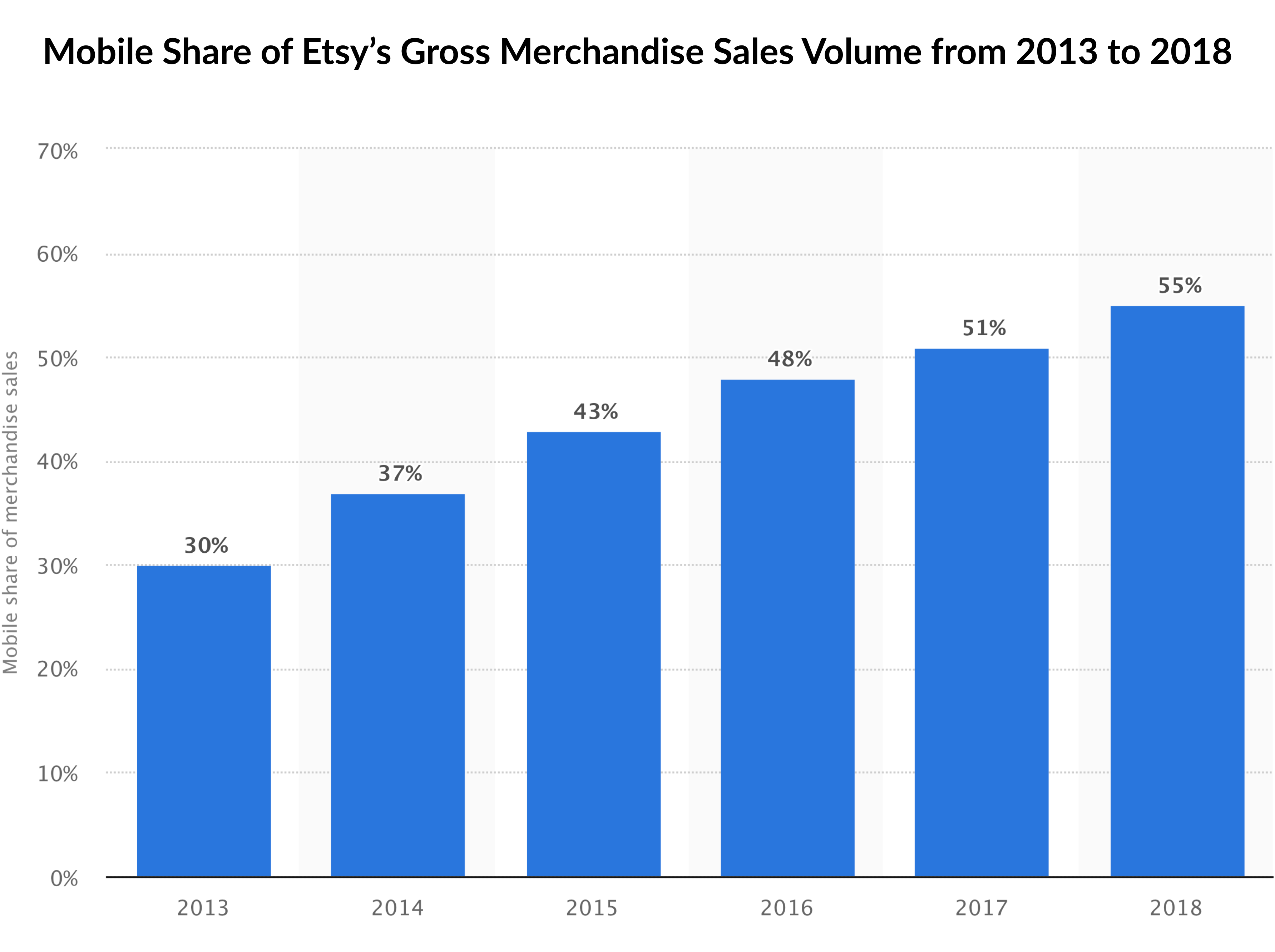
More than 55% of Etsy shoppers completed purchases via mobile smartphone, so the mobile first design principle is important for Etsy. The statistic below represents the mobile share of Etsy's annual merchandise sales volume from 2013 to 2018. In 2018, 55 percent of the company's gross merchandise sales were generated through mobile devices.
Etsy focuses on handmade or vintage items and craft supplies, ranging from art, photography, clothing, jewellery, bath and beauty products, knick-knacks, and toys. The sellers are mainly independent artists due to which the website is now associated with rare artisanal craftsmanship and attracts those with a penchant for unique items that are not commercially mass-produced. Etsy has a certain level of artistic quality. A listing on Etsy lasts for four months or until the item is sold. Once an item sells, there is a 5% transaction fee on the sale price (including the shipping price you set). If users accept payments through Etsy Payments, Etsy collects a 3% + $0.25 payment processing fee when an item is sold as well.
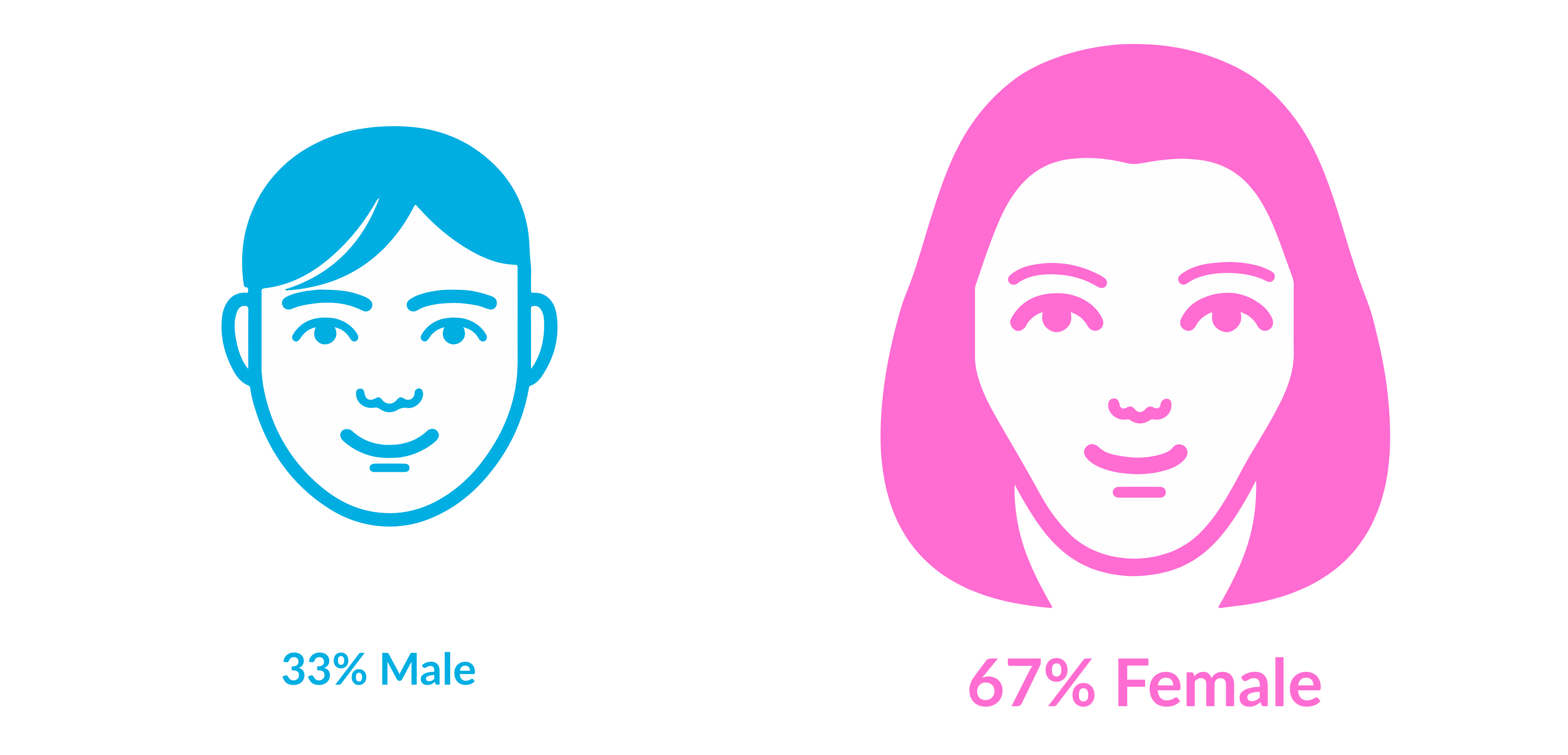
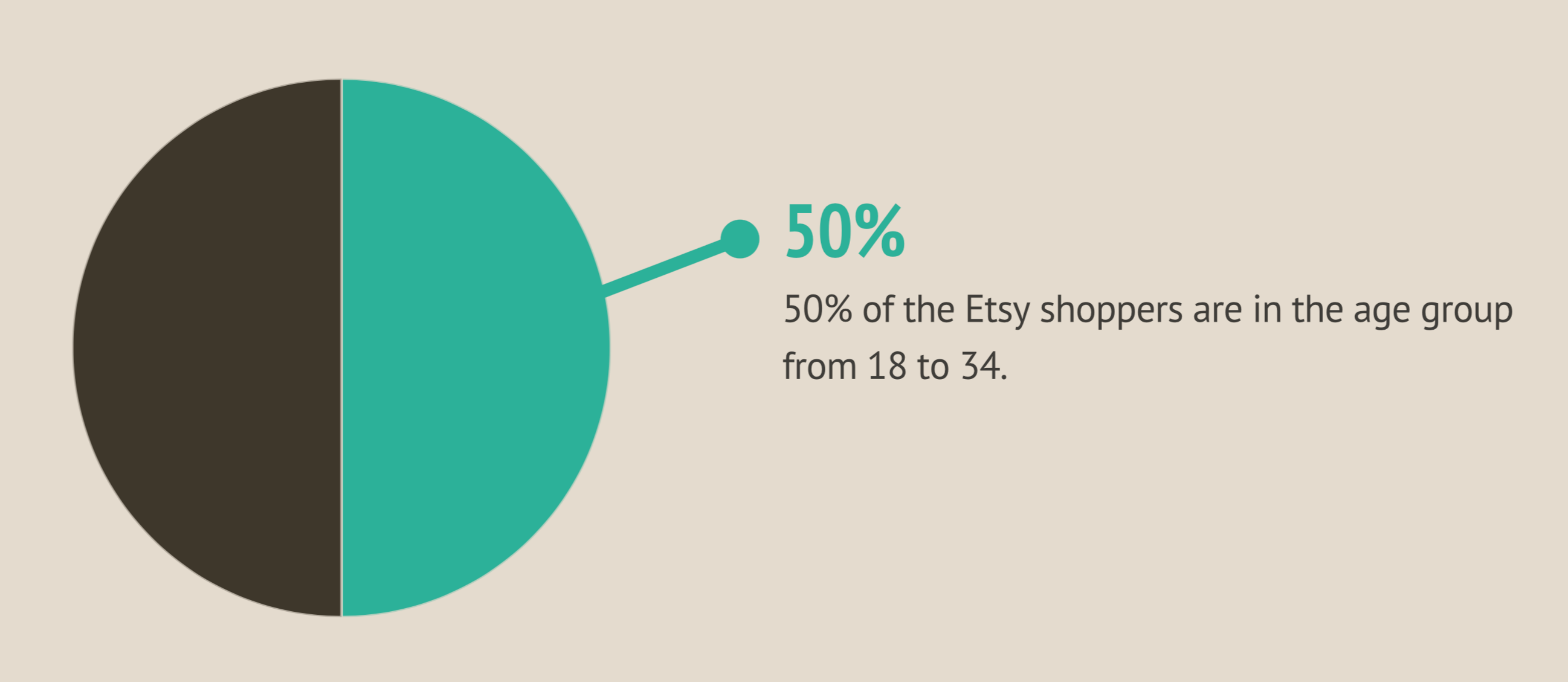
I also researched the demographics of Etsy shoppers. 33% of Etsy shoppers are male and 67% of them are female. 50% of Etsy shoppers are from 18 to 34 years old. It means that Etsy shoppers tend to be young, female and educated.
COMPETITIVE ANALYSIS
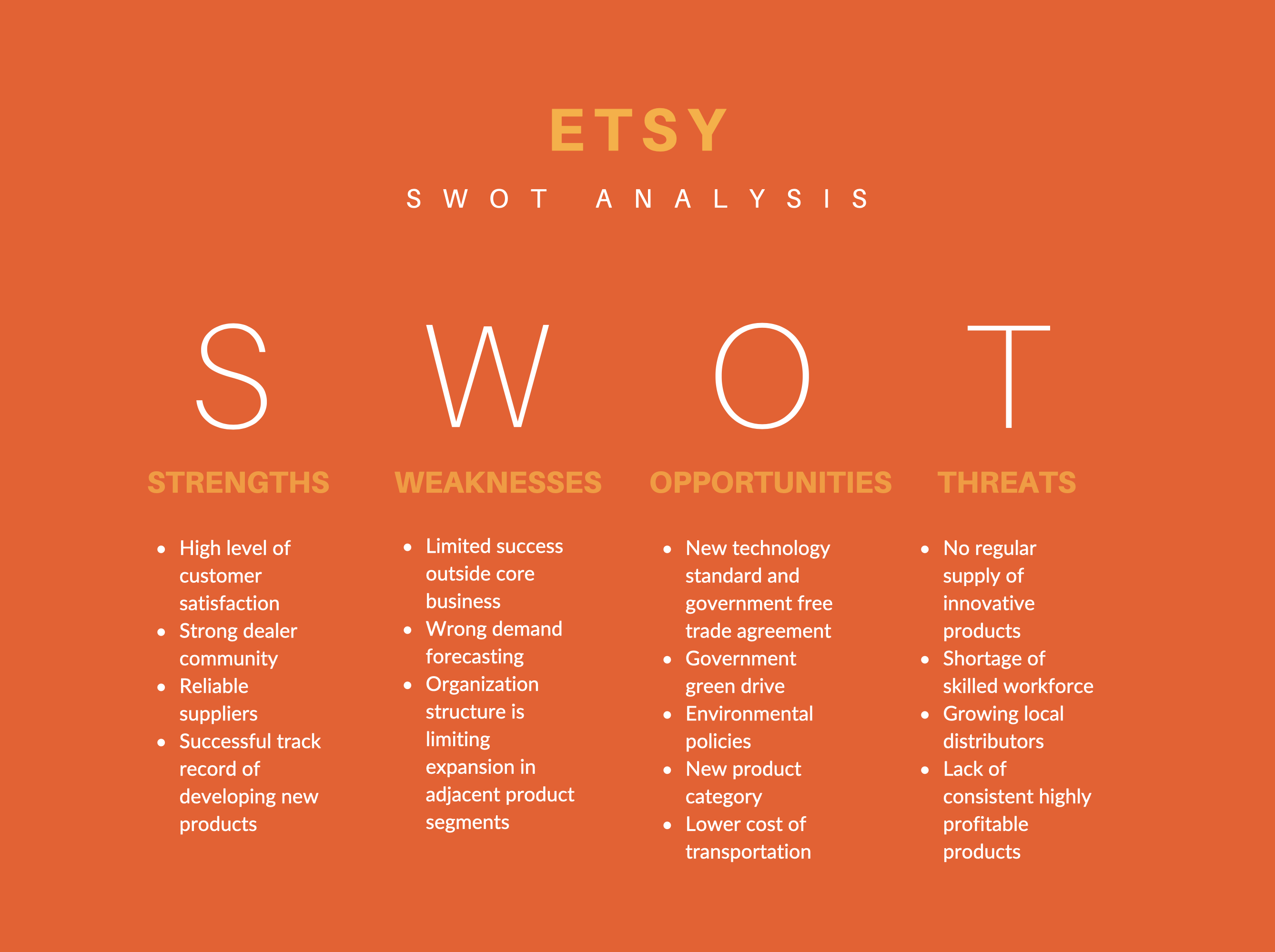
SWOT ANALYSIS
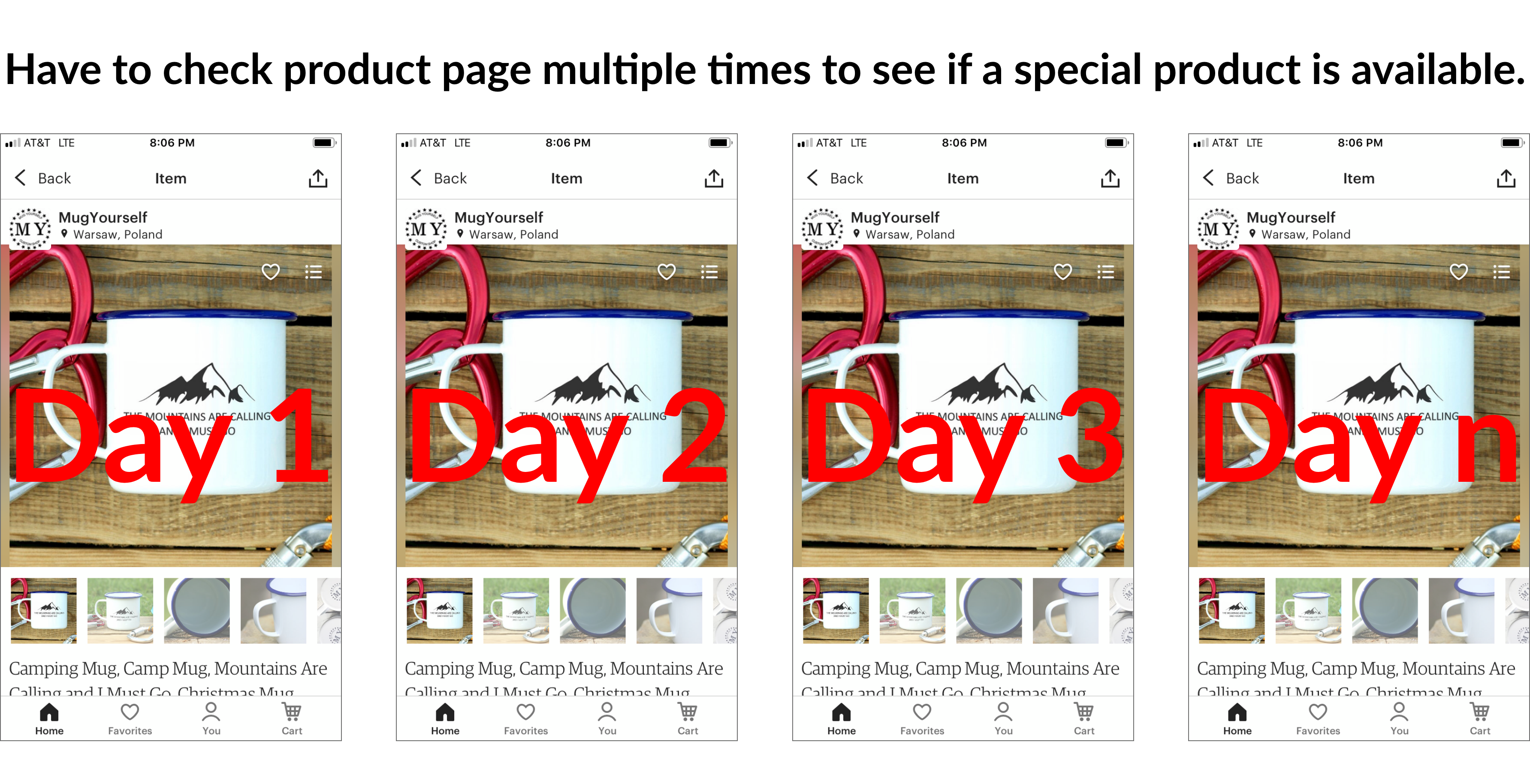
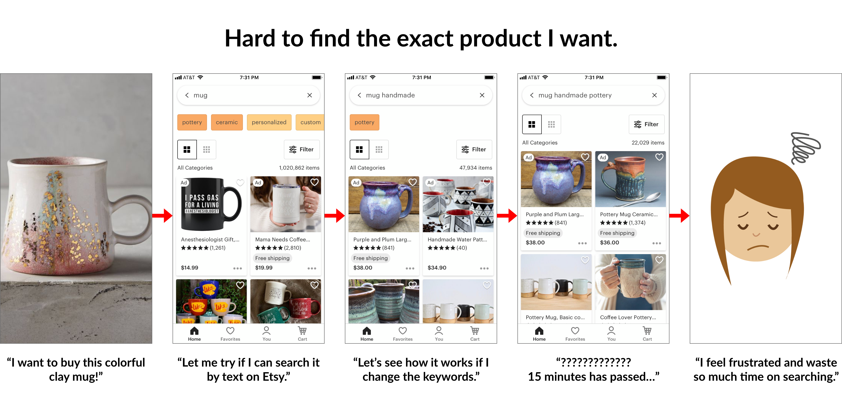
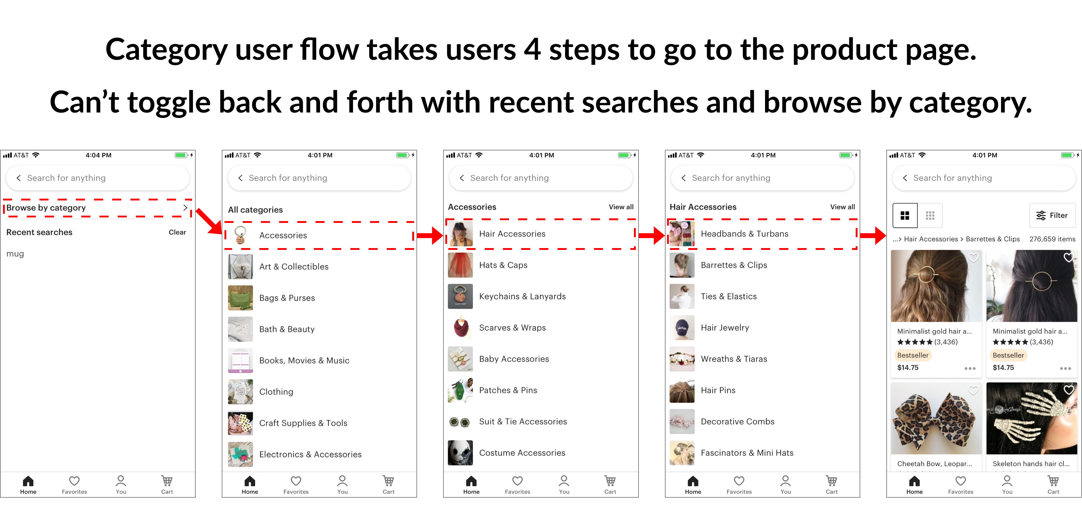
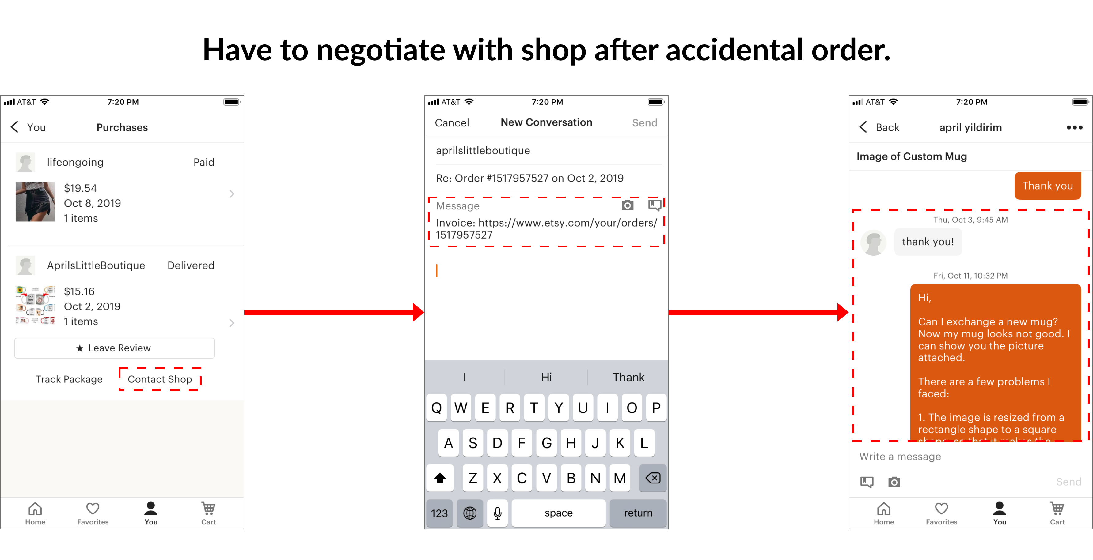
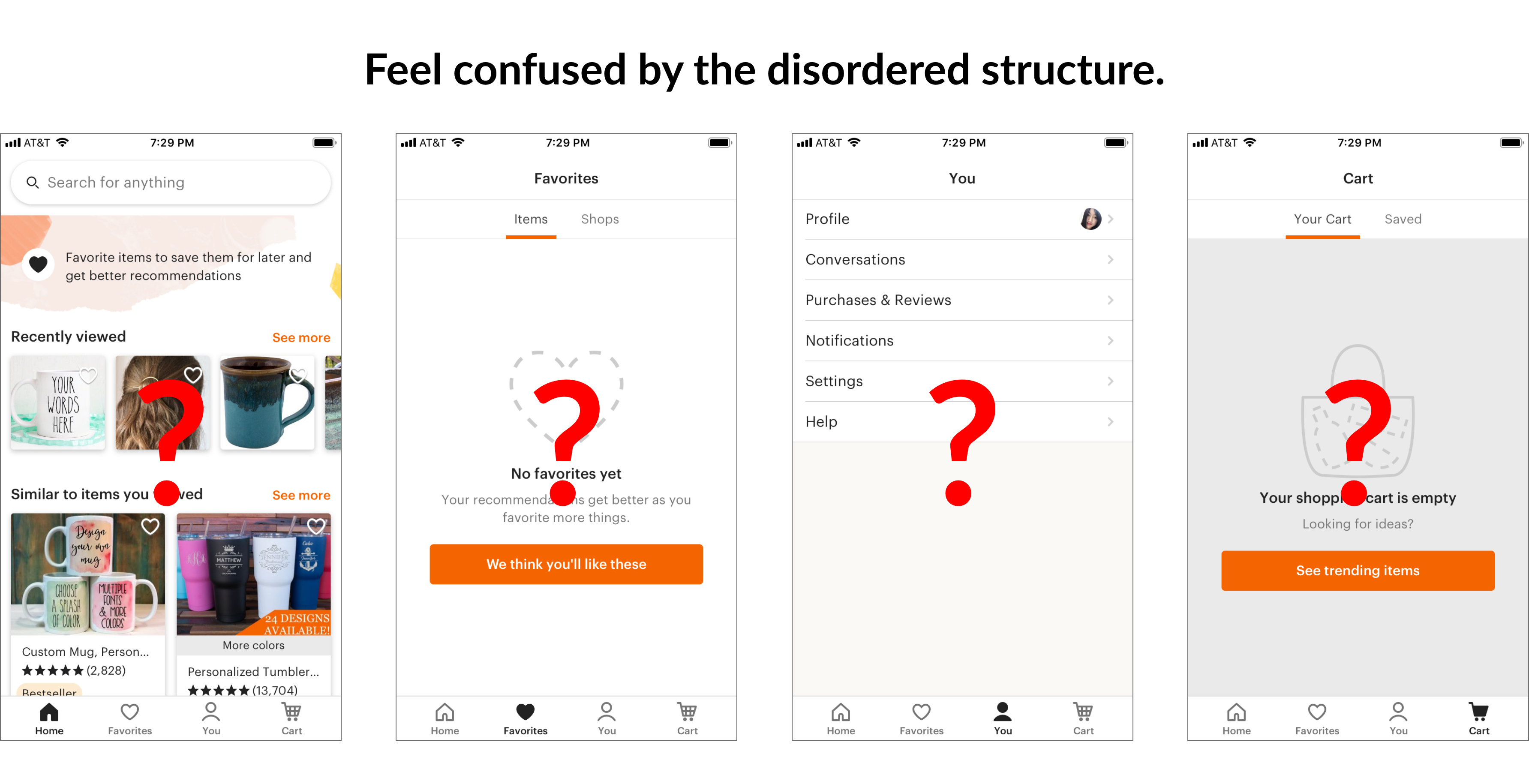
PAIN POINTS
From my research, I mainly realized that my interviewees:
SYNTHESIS
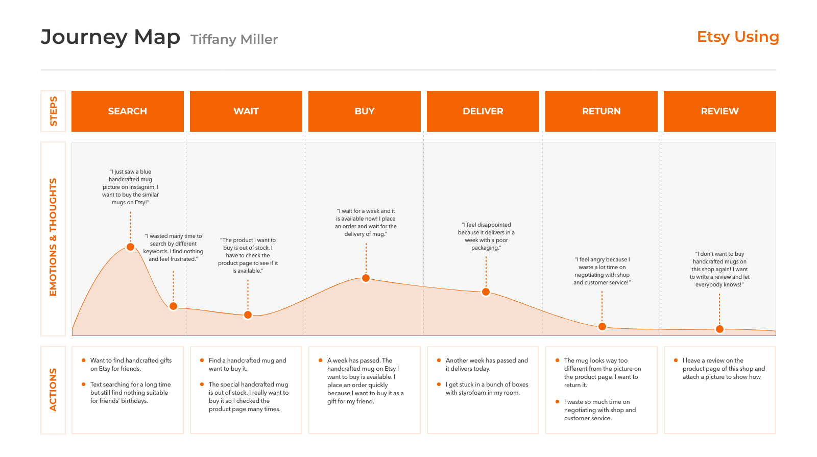
With my research learnings, I created 2 personas that embodied the archetypes of the user group. I mapped out the user journey of the persona Tiffany, including his thoughts and feelings during his typical weekday. From this, I am able to temporarily visualize Tiffany’s areas of frustrations and create a focal point on the problem space.
PERSONAS
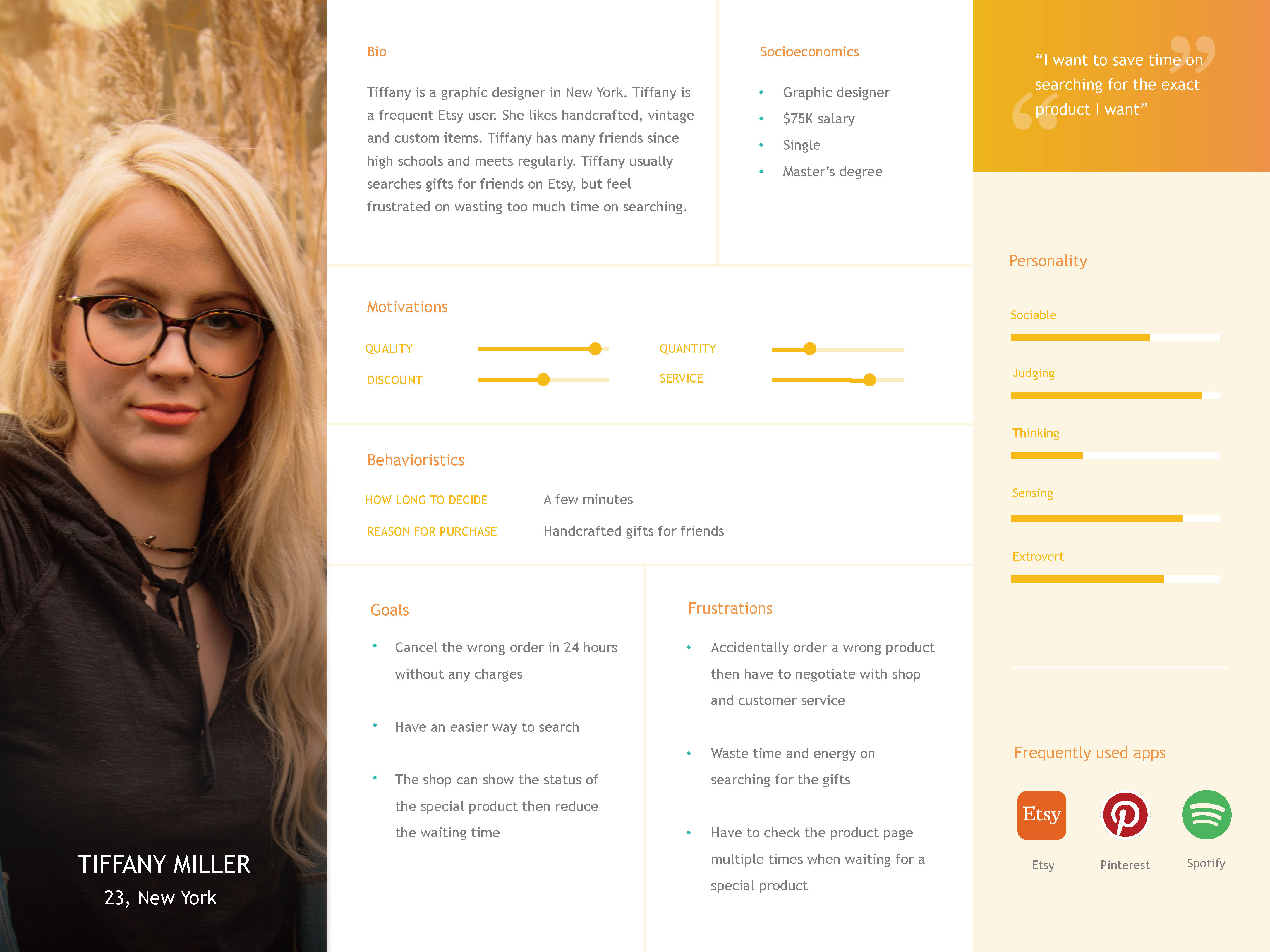
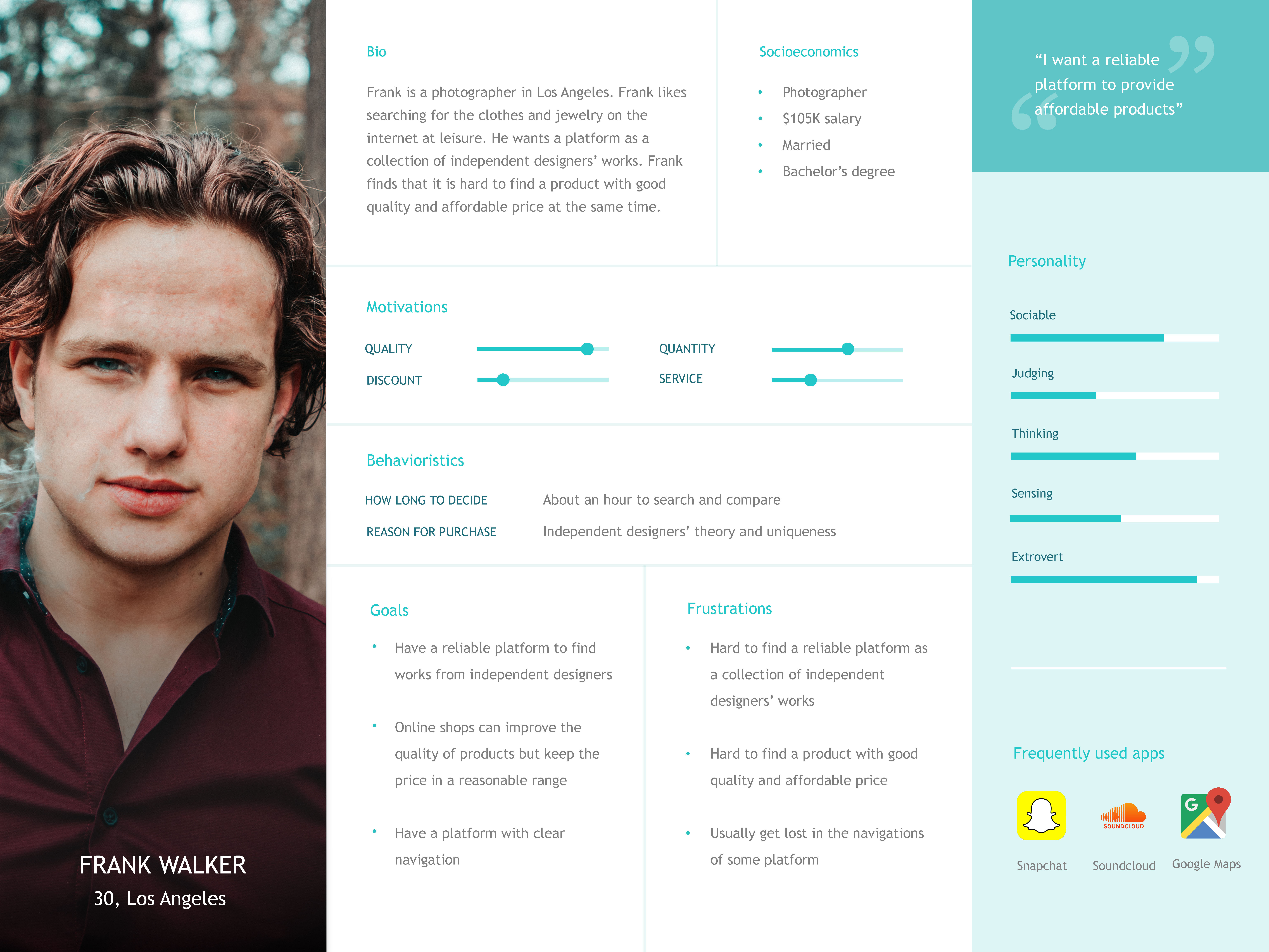
JOURNEY MAP
DESIGN REQUIREMENTS
Using the research and synthesis as guideline, I summarized the findings with a problem statement for the user group: Etsy shoppers need a way to efficiently find and buy what they want.
I identified a list of design requirements to address the problem statements. Most notably, the solution needs to:
Ideation
With the design requirements in mind, I conducted the online hybrid card sorting to help me understand how users label different groups and redesign the information architecture of Etsy app. I finally got the analysis of card sort data to greatly help me define the iterated navigation of Etsy redesign. I showed dendrogram and similarity matrix as parts of the analysis result.
HYBRID CARD SORTING
INFORMATION ARCHITECTURE
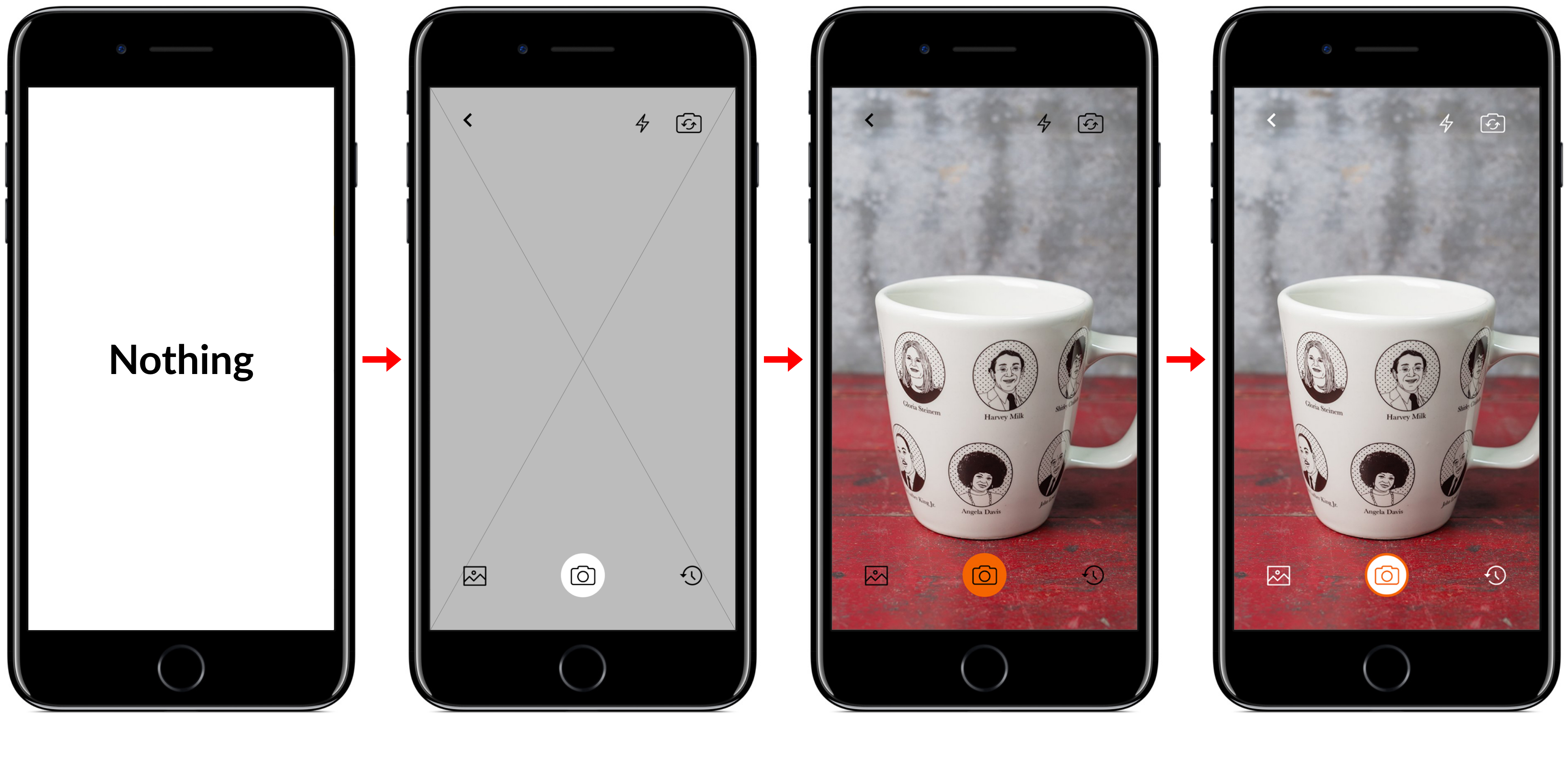
I went through the different possible designs that my solutions could take including local workshop, image searching, etc. I ultimately decided to:
I bucketed the design requirements as feature components on the information architecture (IA) to restructure Etsy. The texts and lines which are marked as red are where my redesign will cover.
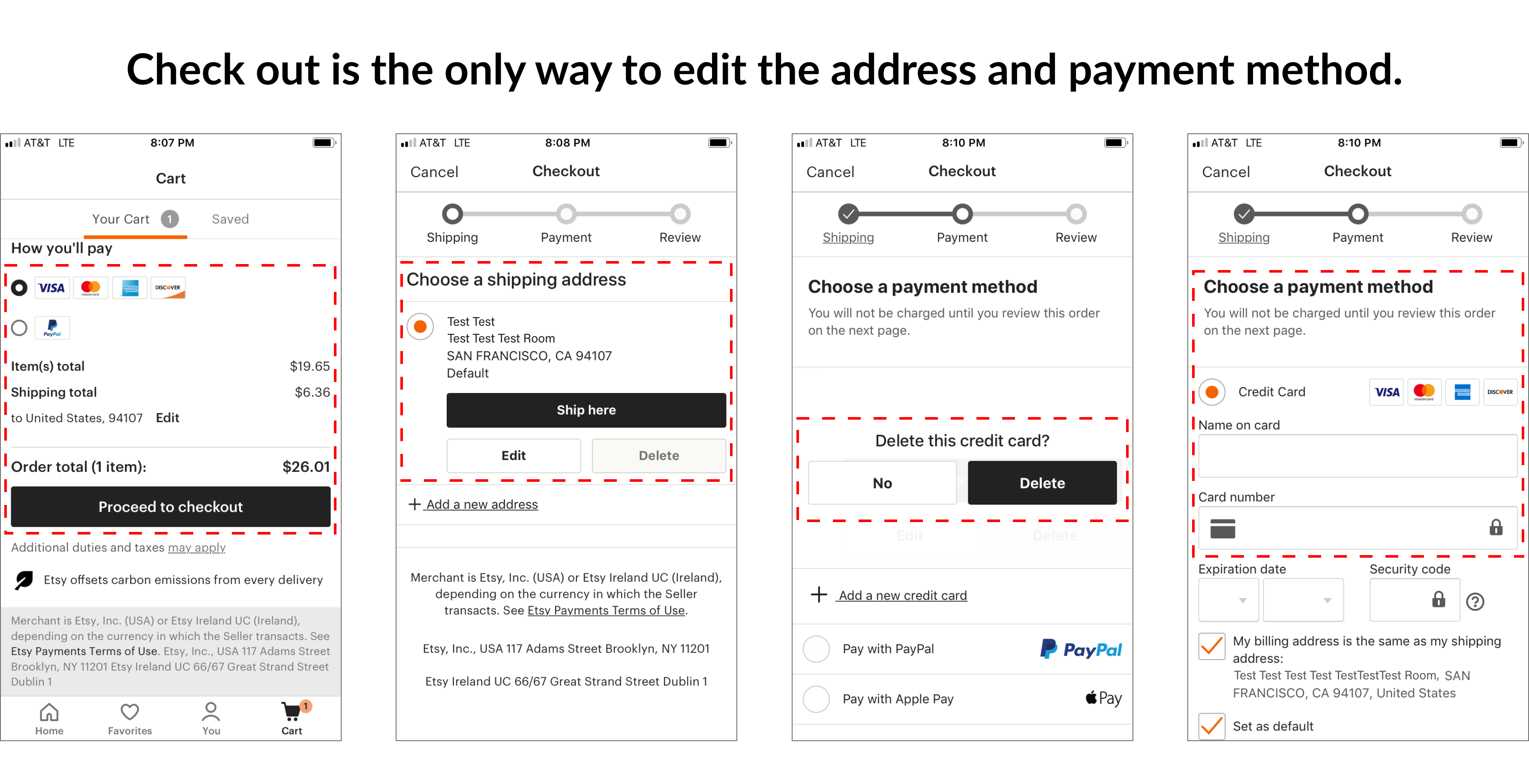
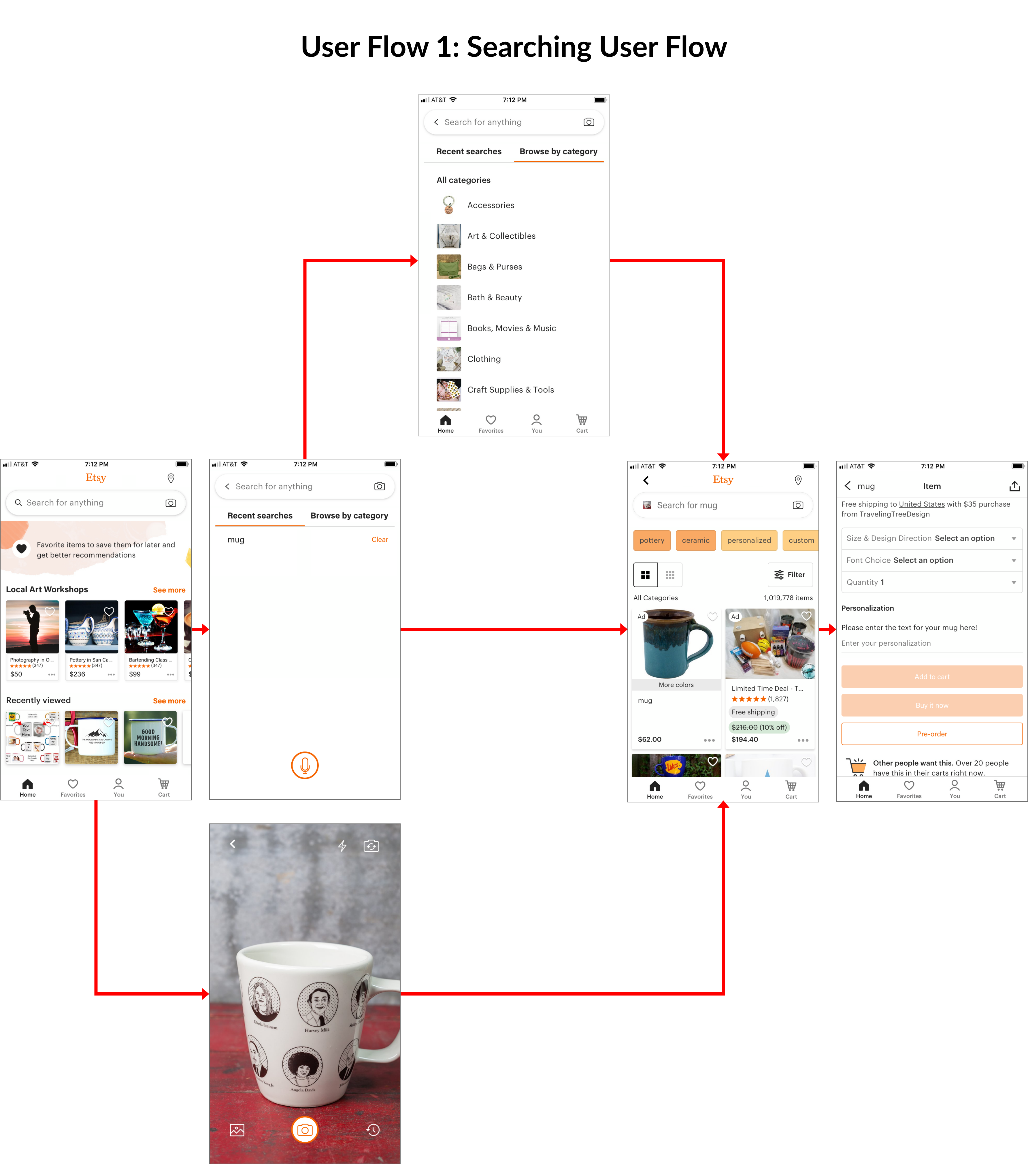
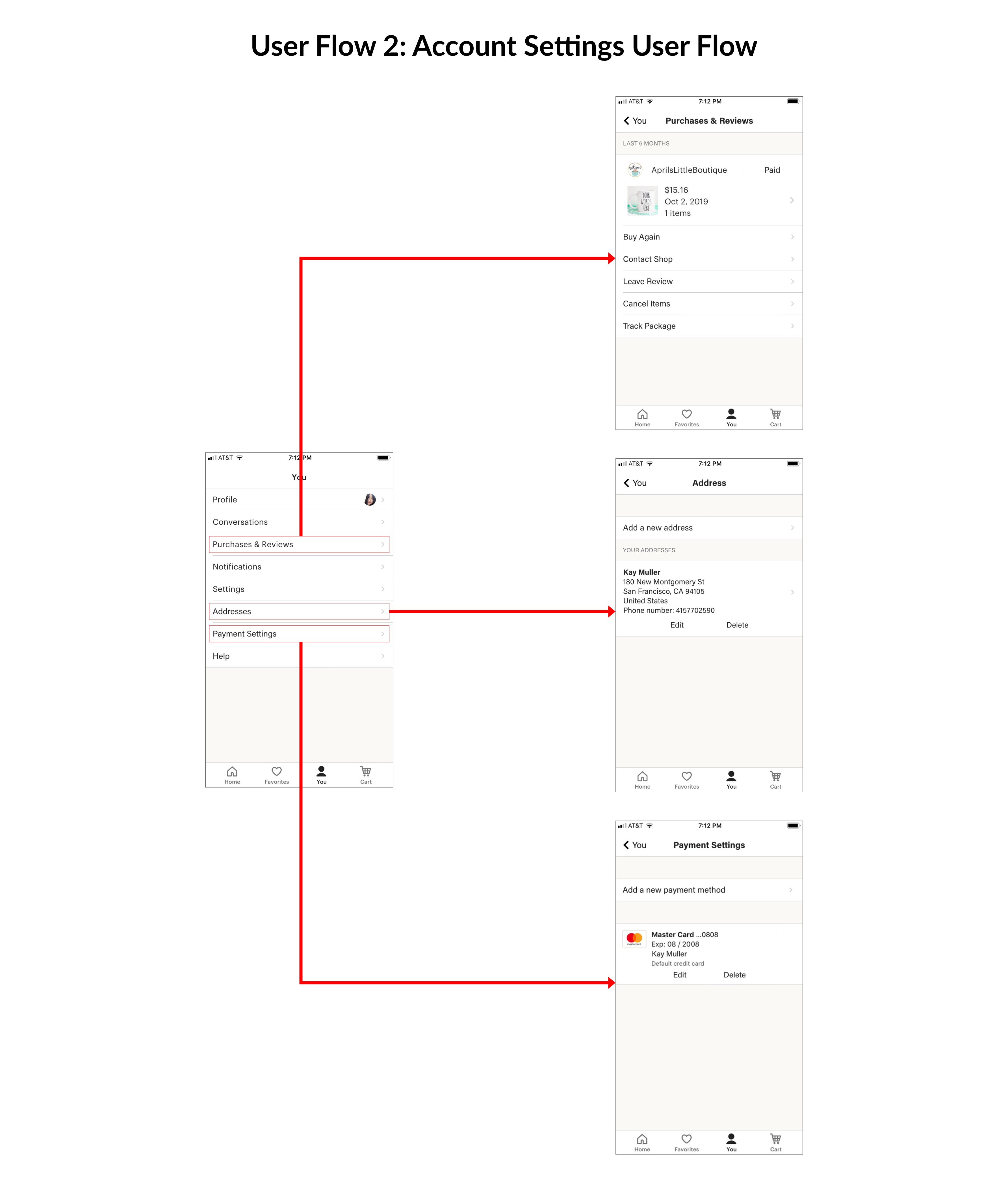
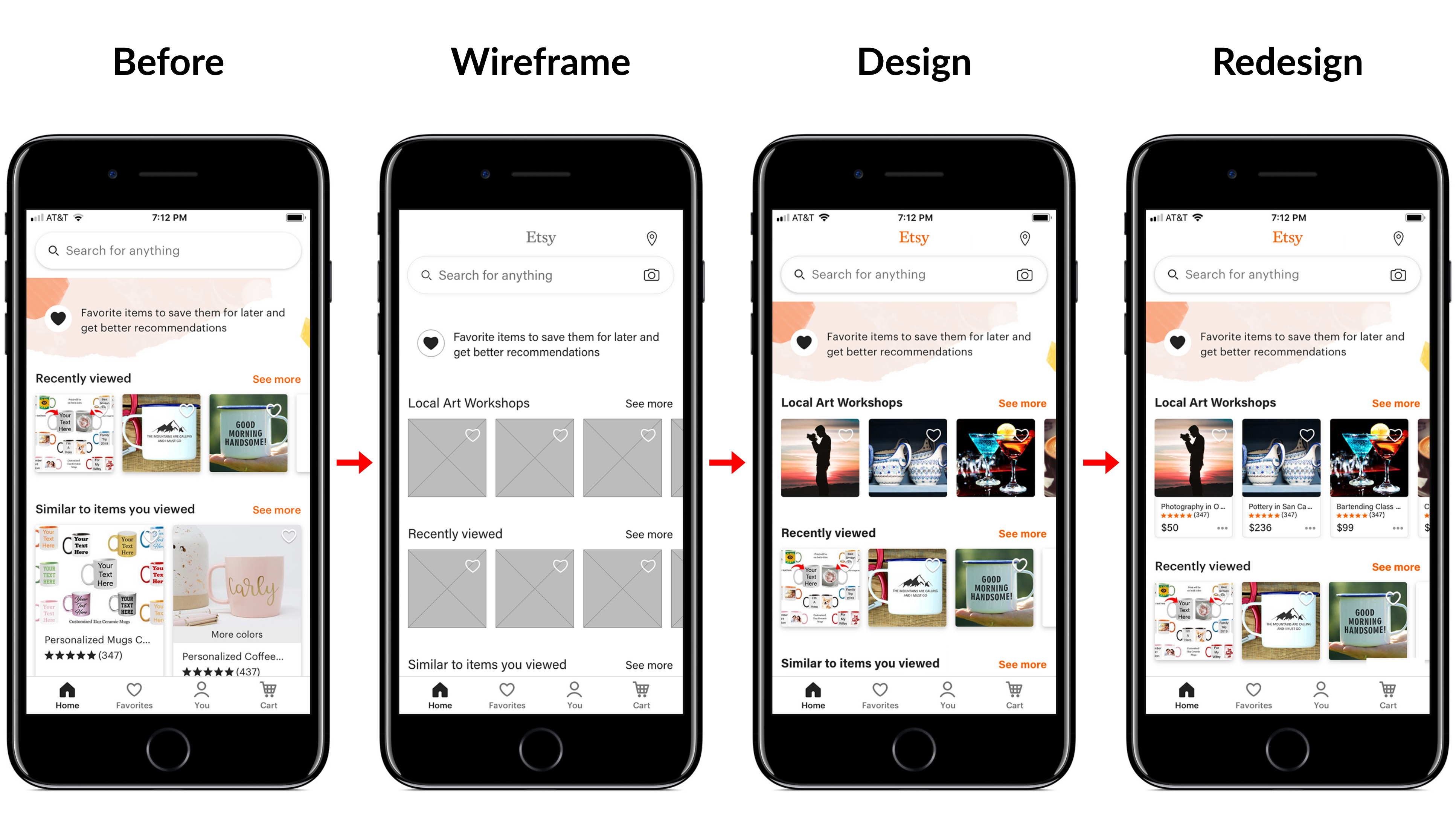
WIRE FLOW
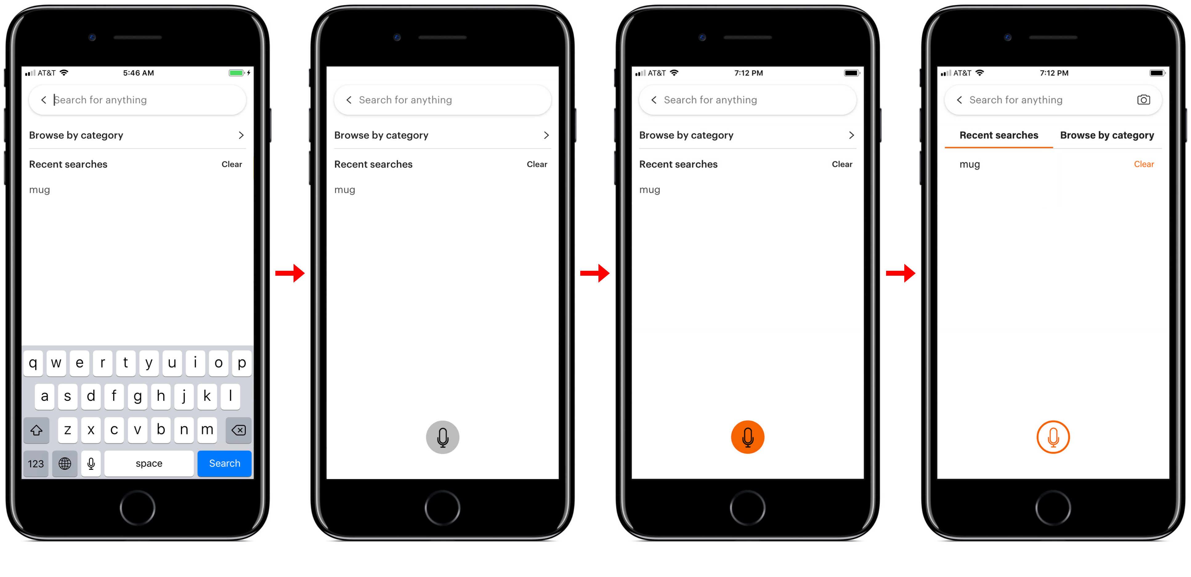
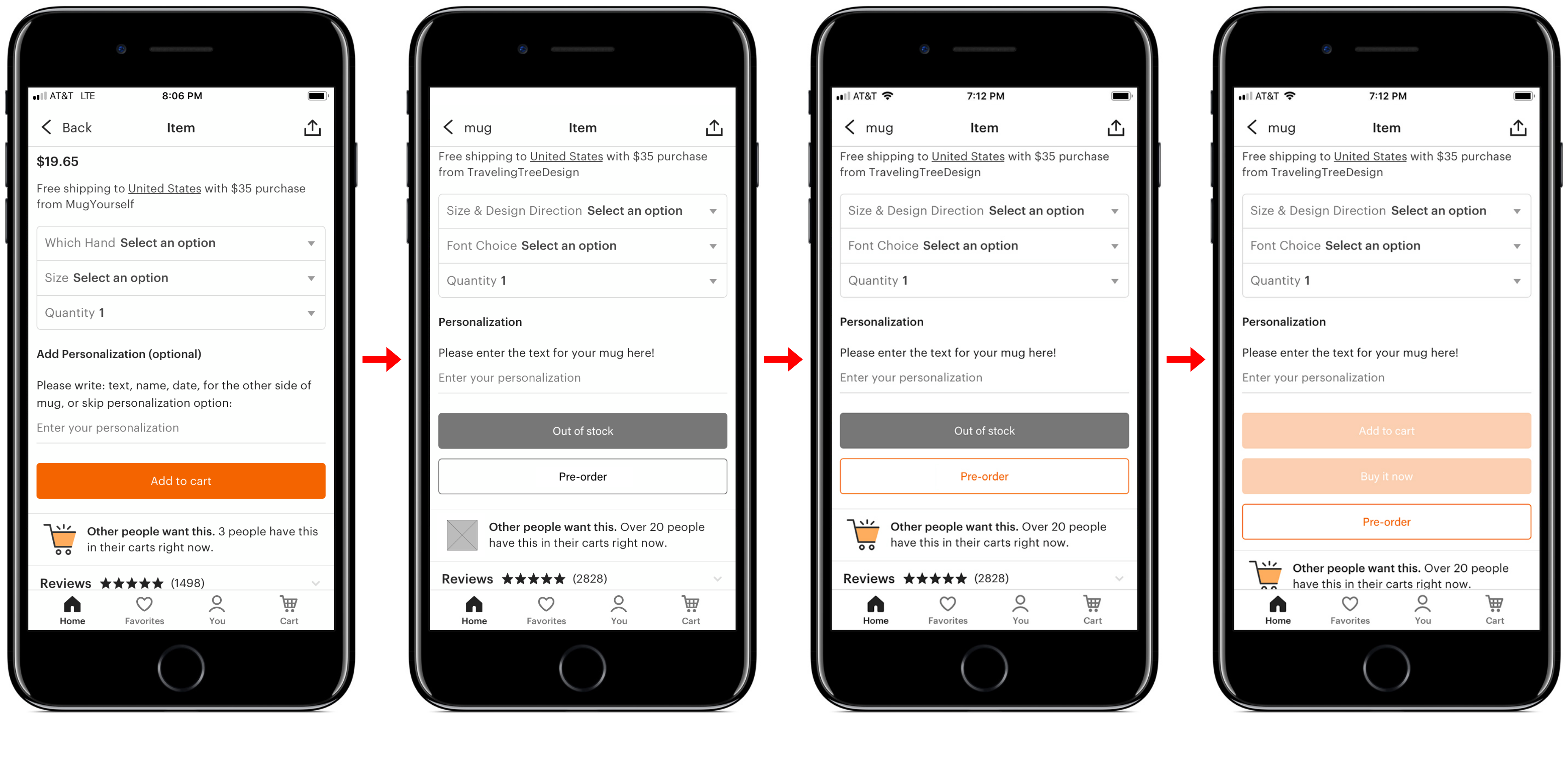
I outlined the wireframes of the new version of Etsy based on the IA and created several key path scenarios to further analyze the flow of interaction of the updated version of Etsy.
FIRST CLICK TESTING
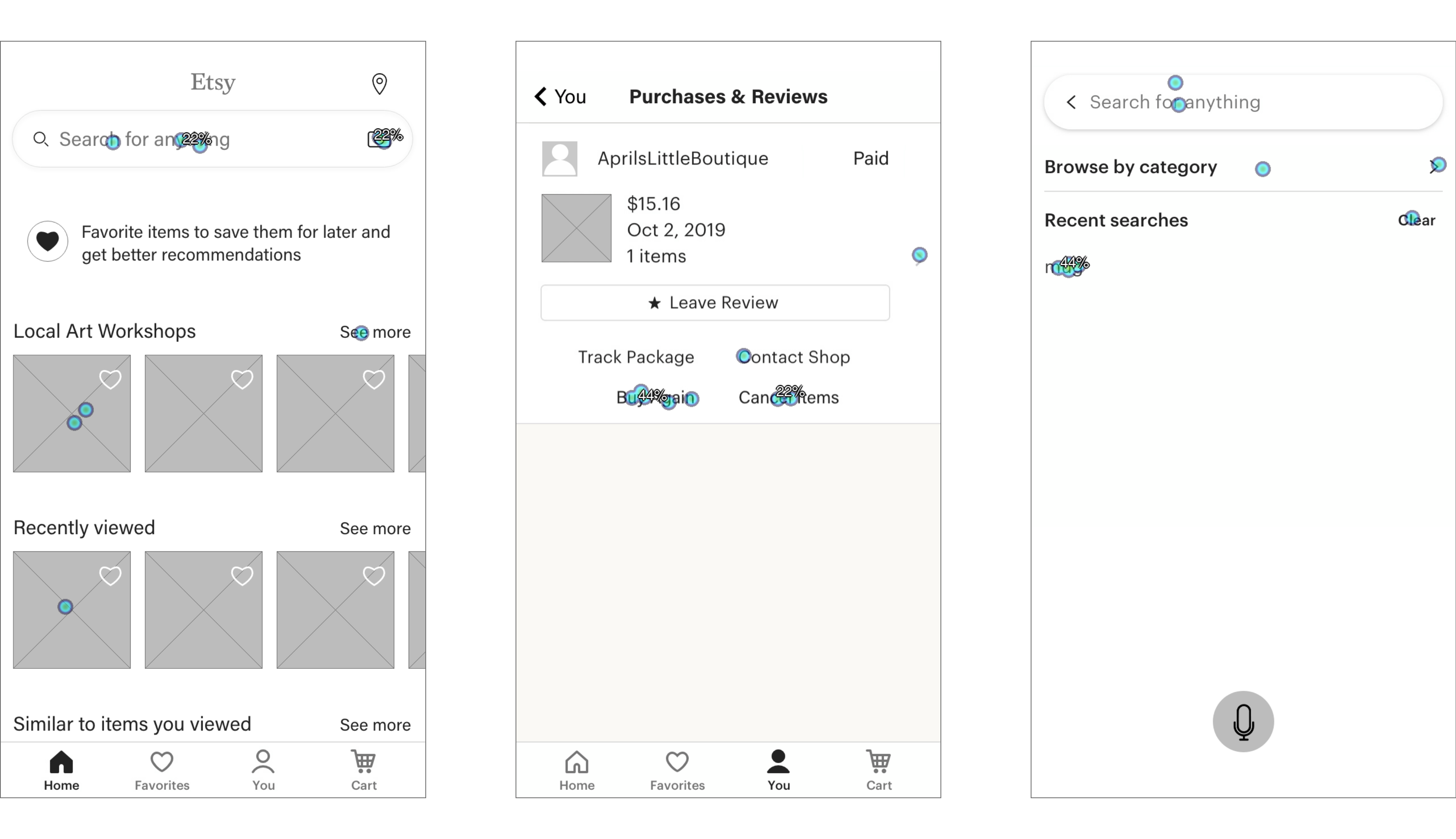
I conducted a first click test about the low fidelity wireframes of Etsy Redesign. I tested 3 main screens of 2 main wire flows. Finally I got the heatmaps which can be a visual clue to show how users might interact with these wireframes.
Design
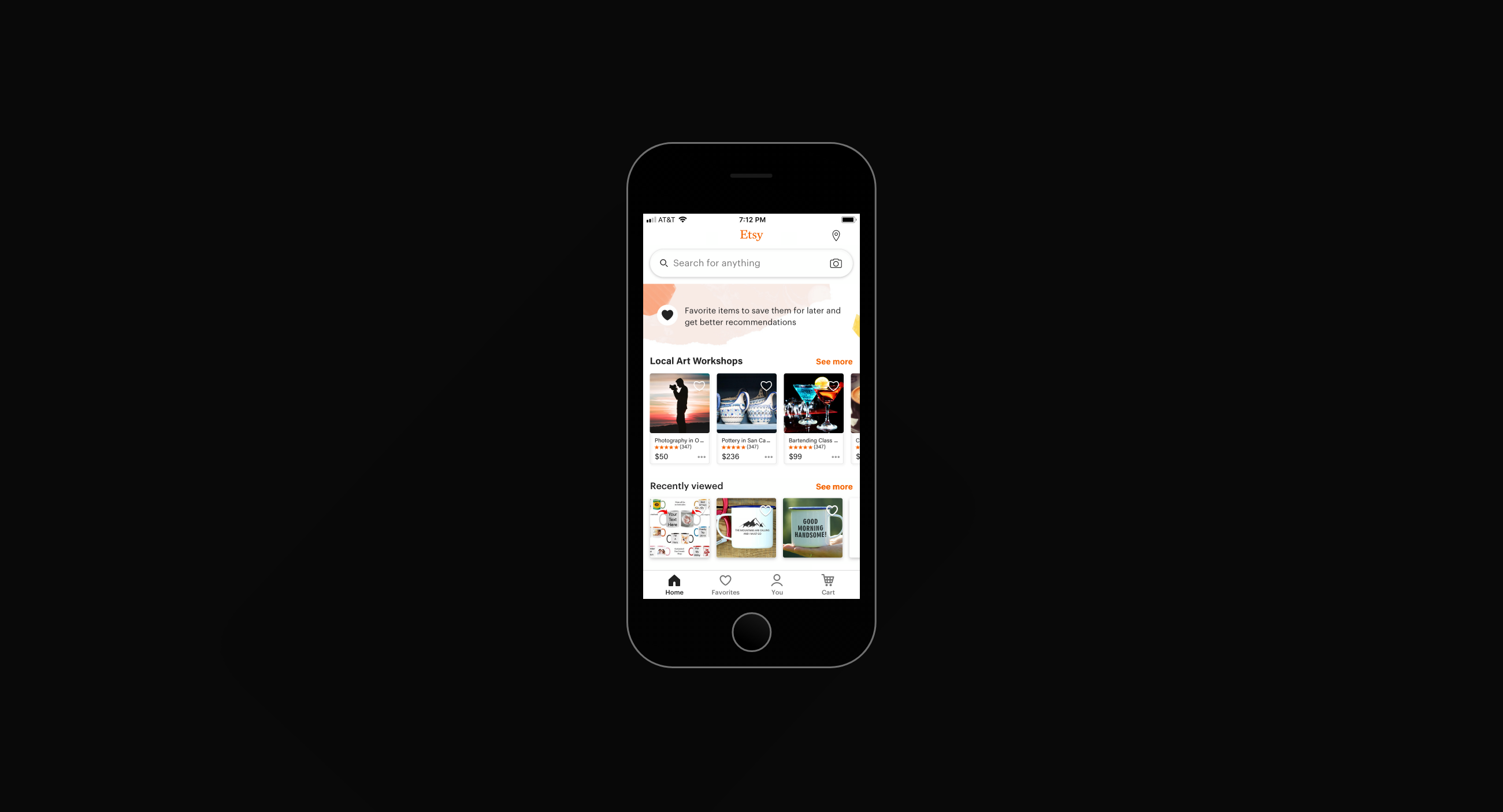
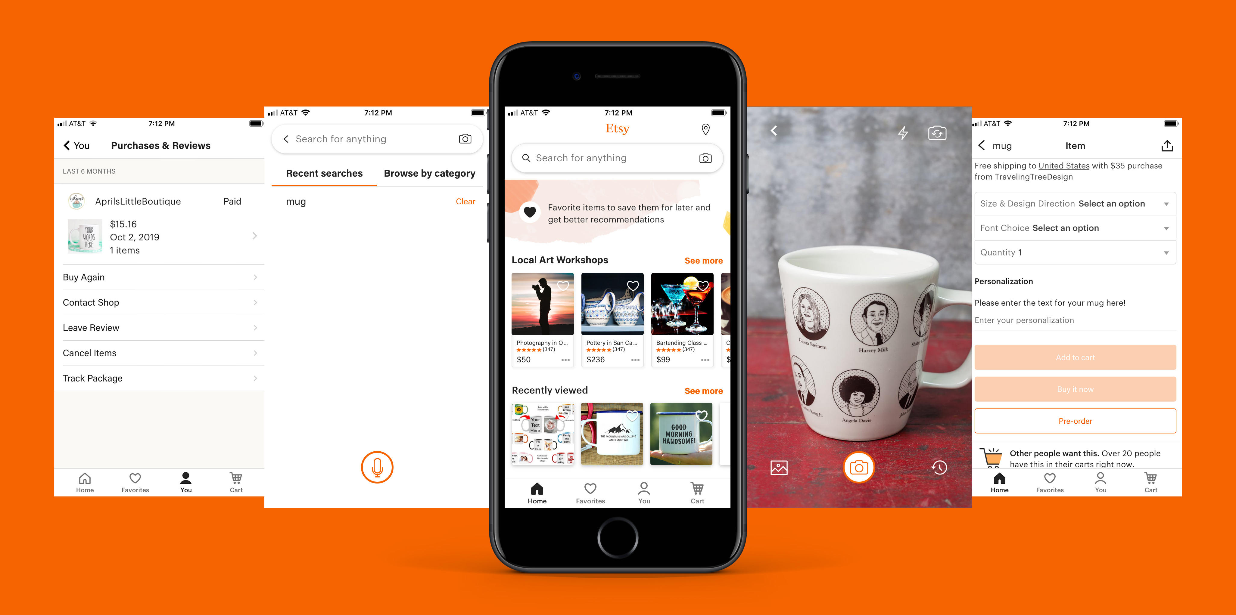
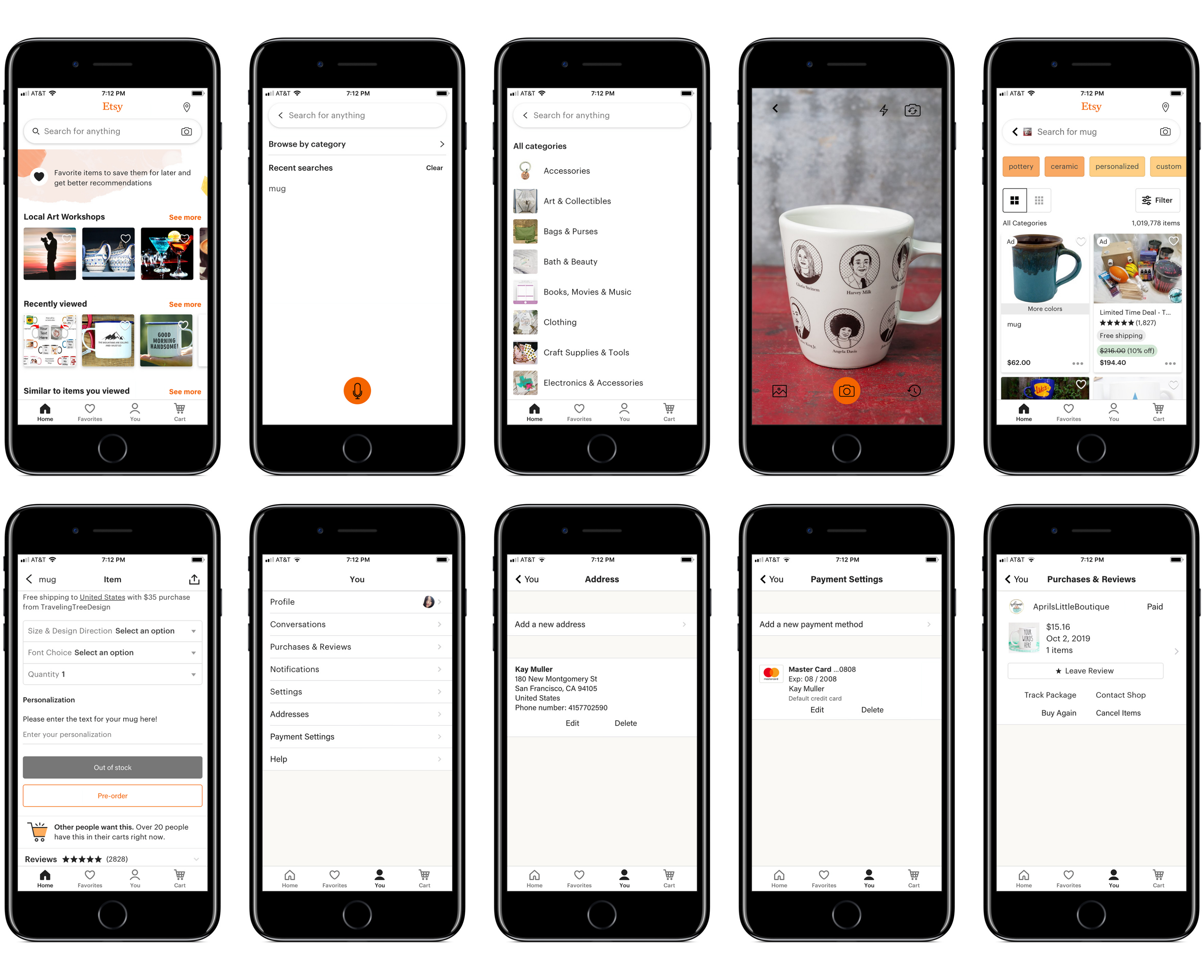
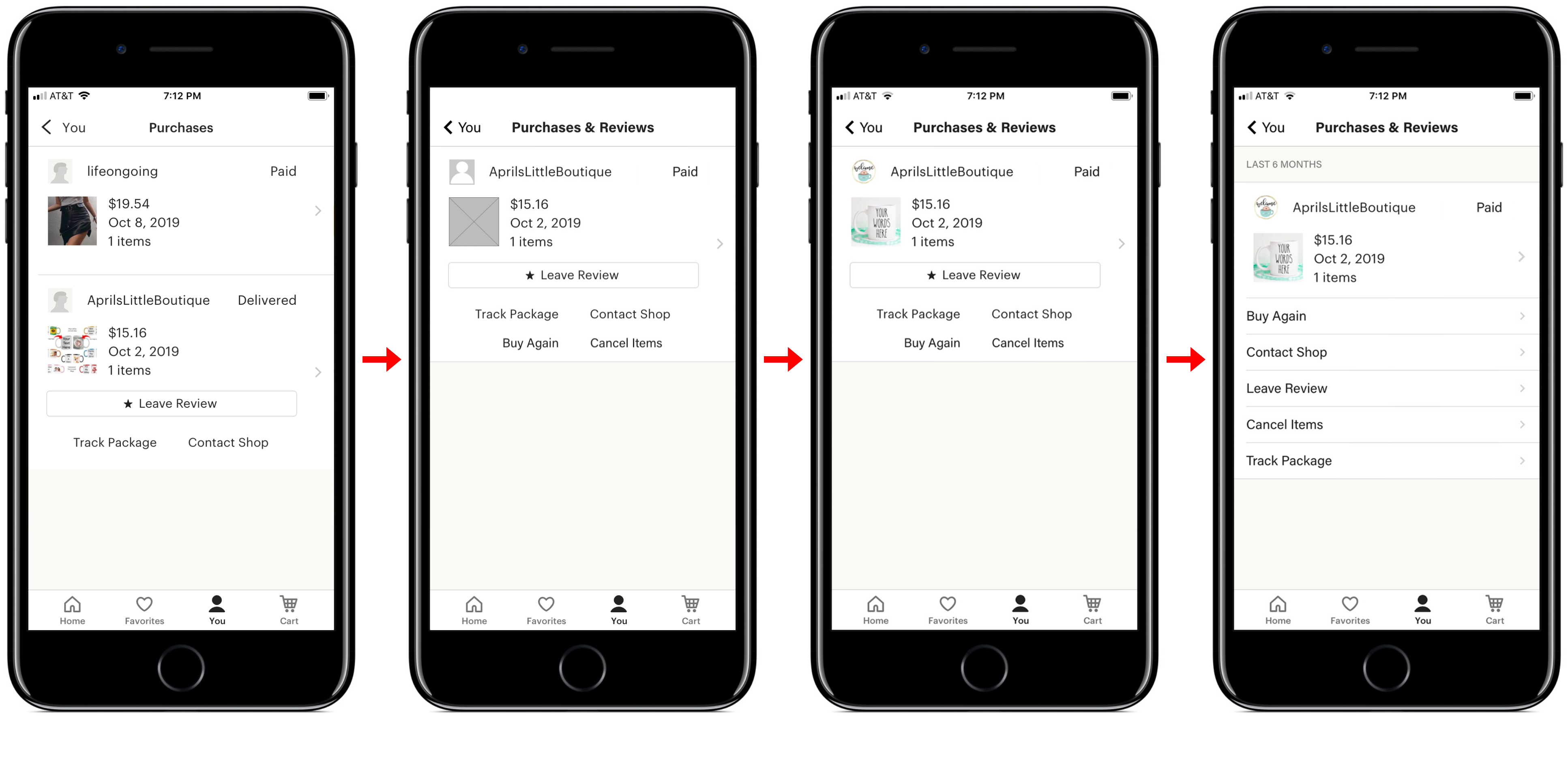
Based on the analysis of first click testing result and in-person usability test, I decide to keep the picture search function and local art workshops on the home page, buy again and cancel items function on the purchase & reviews page, recent searches on the search screen. I tried to explore multiple designs for different screens. After several rounds of critiques on the wireframes, I moved on to high fidelity mockups. The motivation of the visual design was to create a aesthetic look that entices more users to use Etsy. I followed the current Etsy style guide and continued using Etsy orange color as the main theme.
Redesign
I conduct the in-person usability test to know how users interact with the new design of Yelp and gather the feedback to identify usability issues.
According to the feedback, I decided to improve the visuals, the information hierarchy, and overall experience of the app so I decided to redesign it. To create a better consistency, I came up with the redesign.
ITERATION
Strategy
SOUL
Enjoy the vintage world.
MISSION
BRAND KEYWORDS
Interactive, convenient, clear, consistent, creative, engaging, aesthetic.
BUSINESS EXTENSION
Local Art Workshop: Add local art workshop section to the home page. Charge hosts who provide workshops 10% service fee.
Reflection
In terms of this project, I realized that simple UI embellishment can only produce surface delight. The deep delight can only be achieved based on the fundamentals of the product right like functional, usable, useful, desirable and reliable interfaces. Delight is about the users. Delight consists of pleasure, flow and meaning. I want to achieve delight in product design since it is missing for most of the products. I will focus more on the needs of users and help users become better at the thing they are trying to achieve.